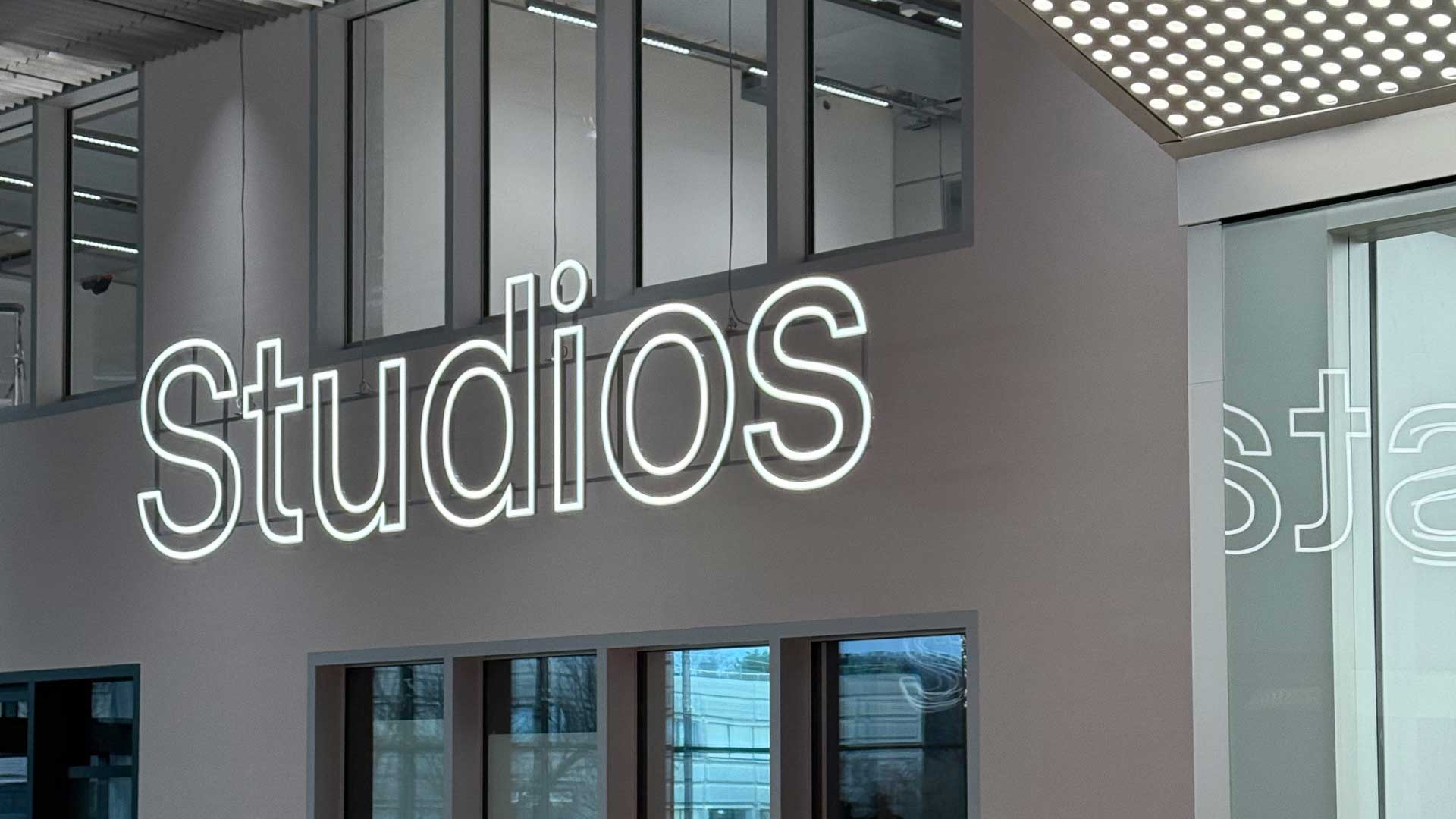
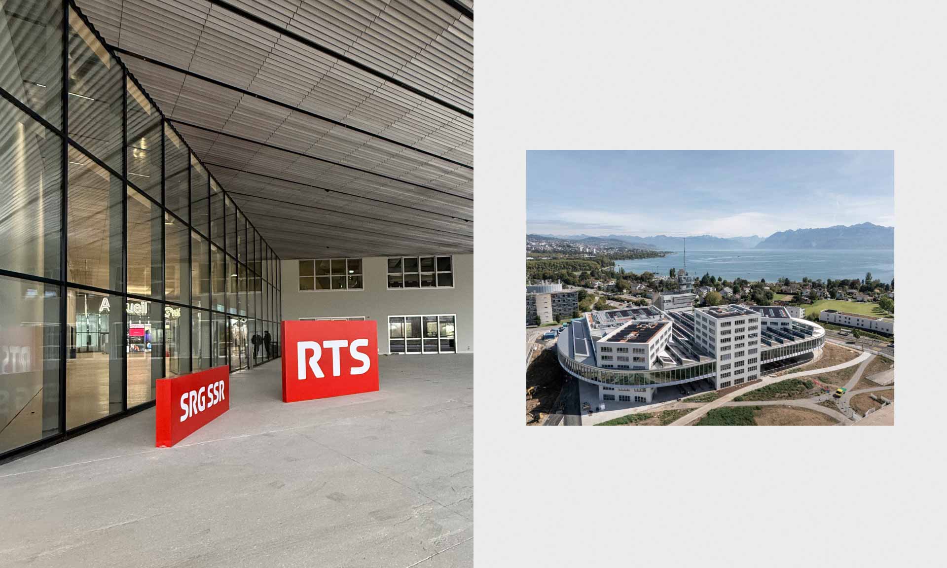
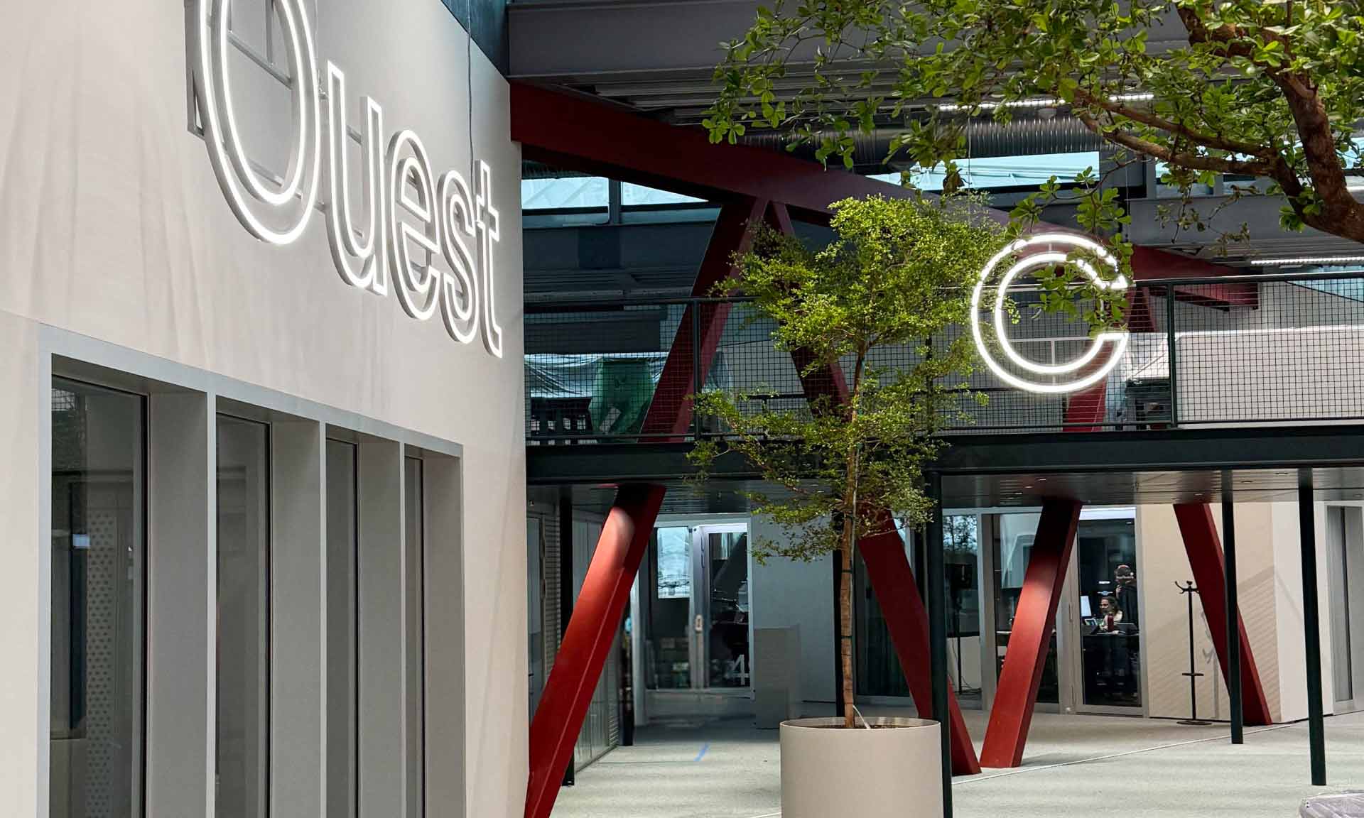
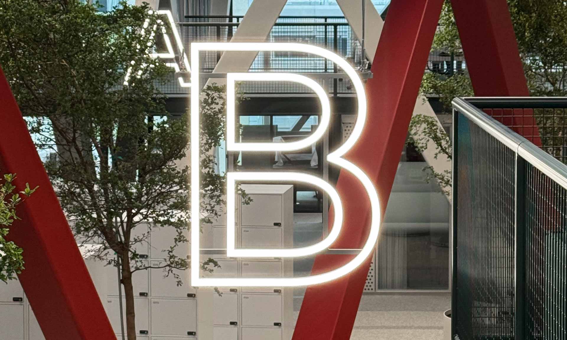
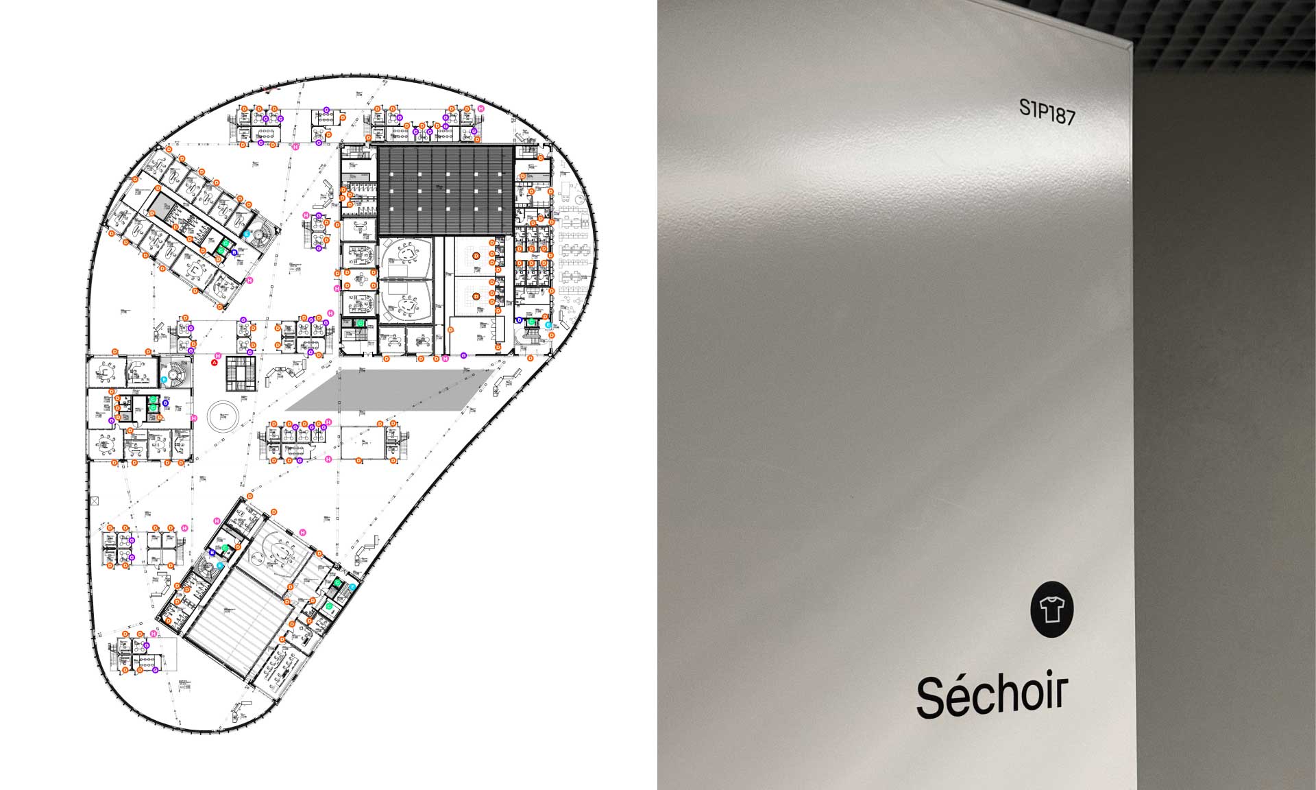
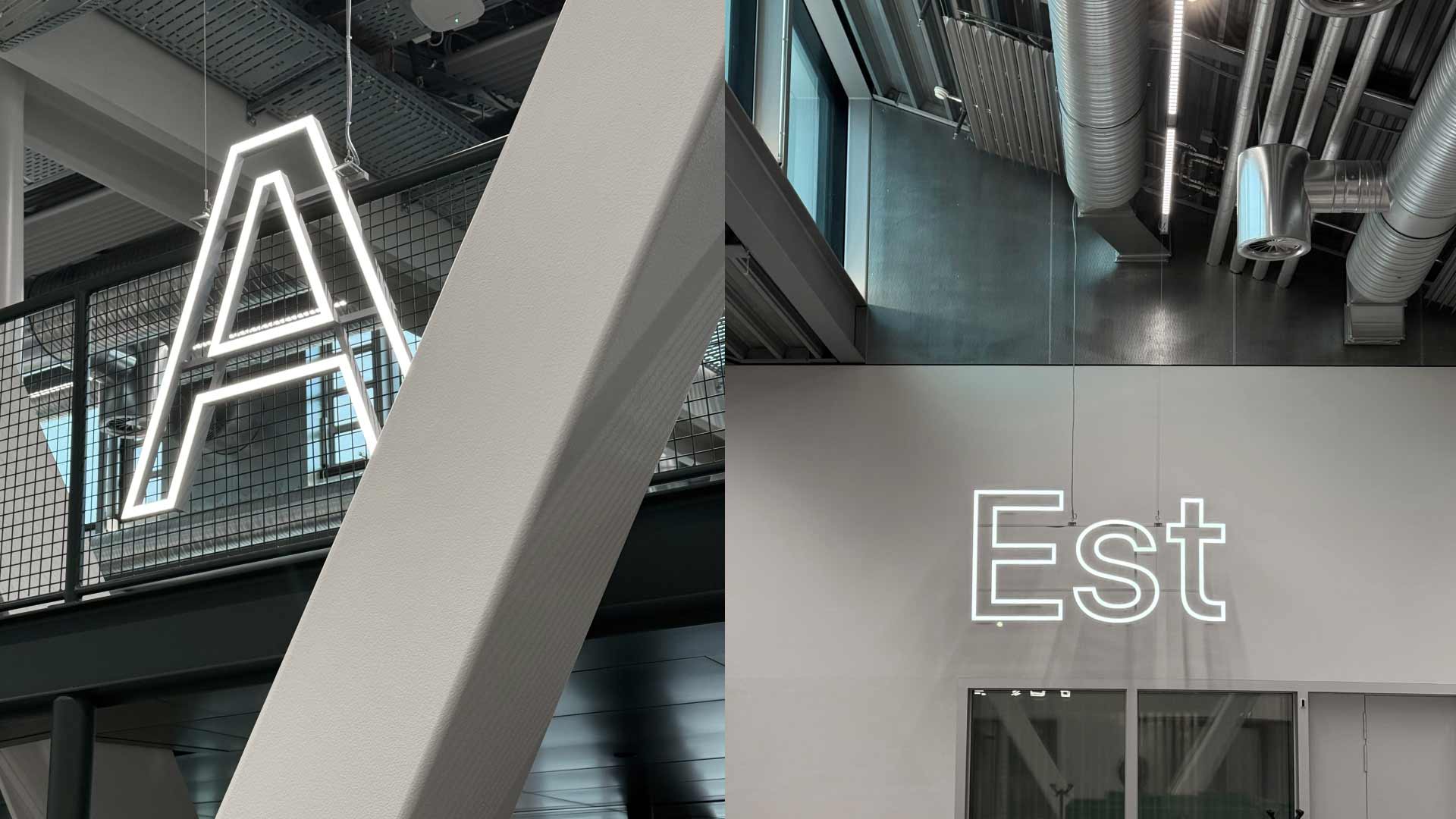
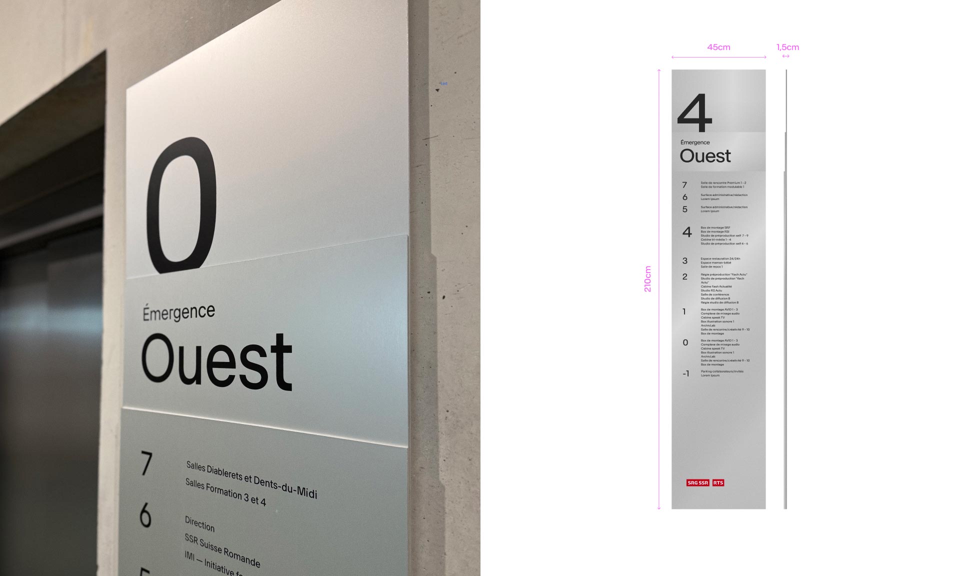
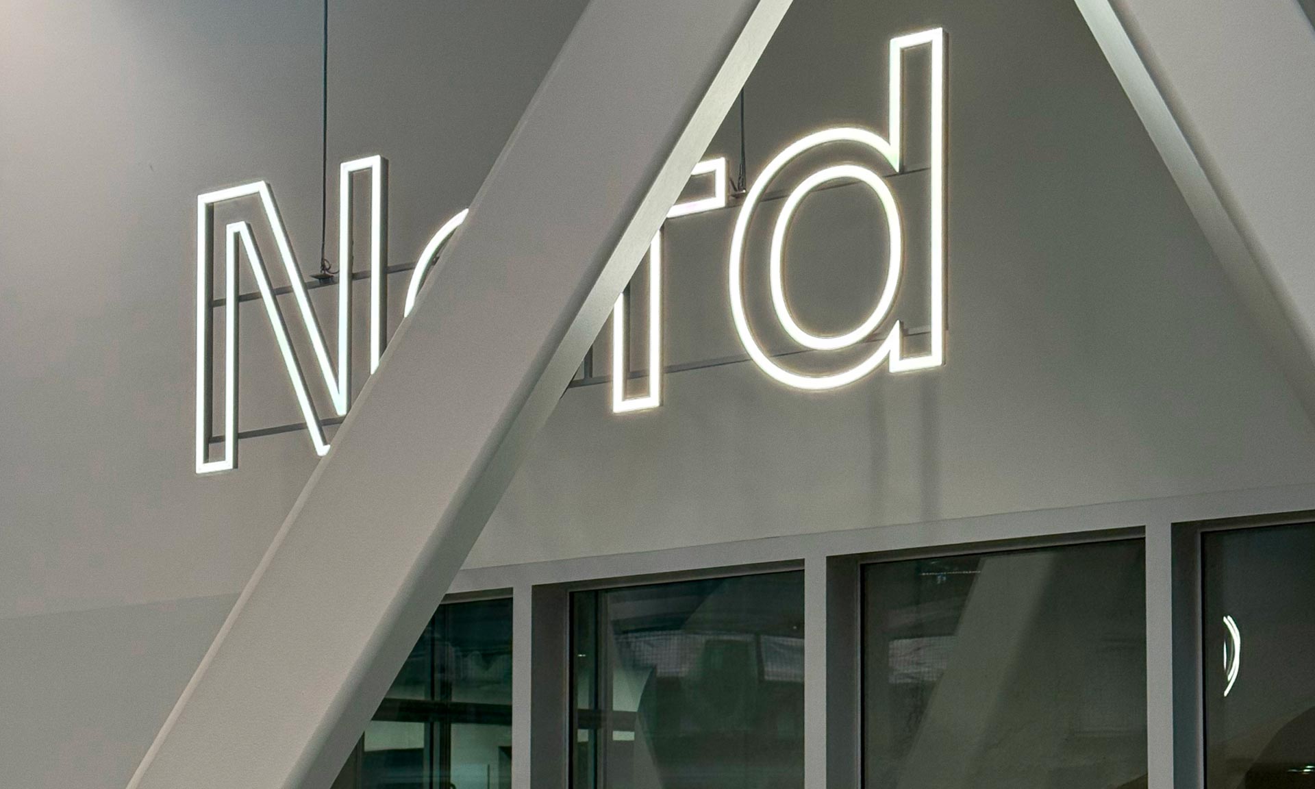
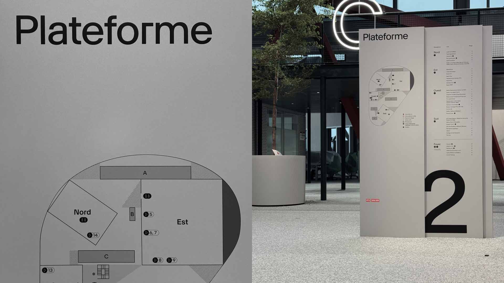
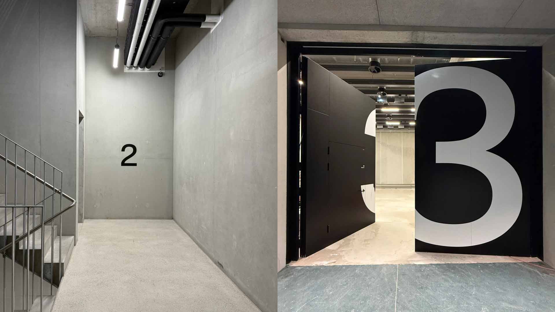
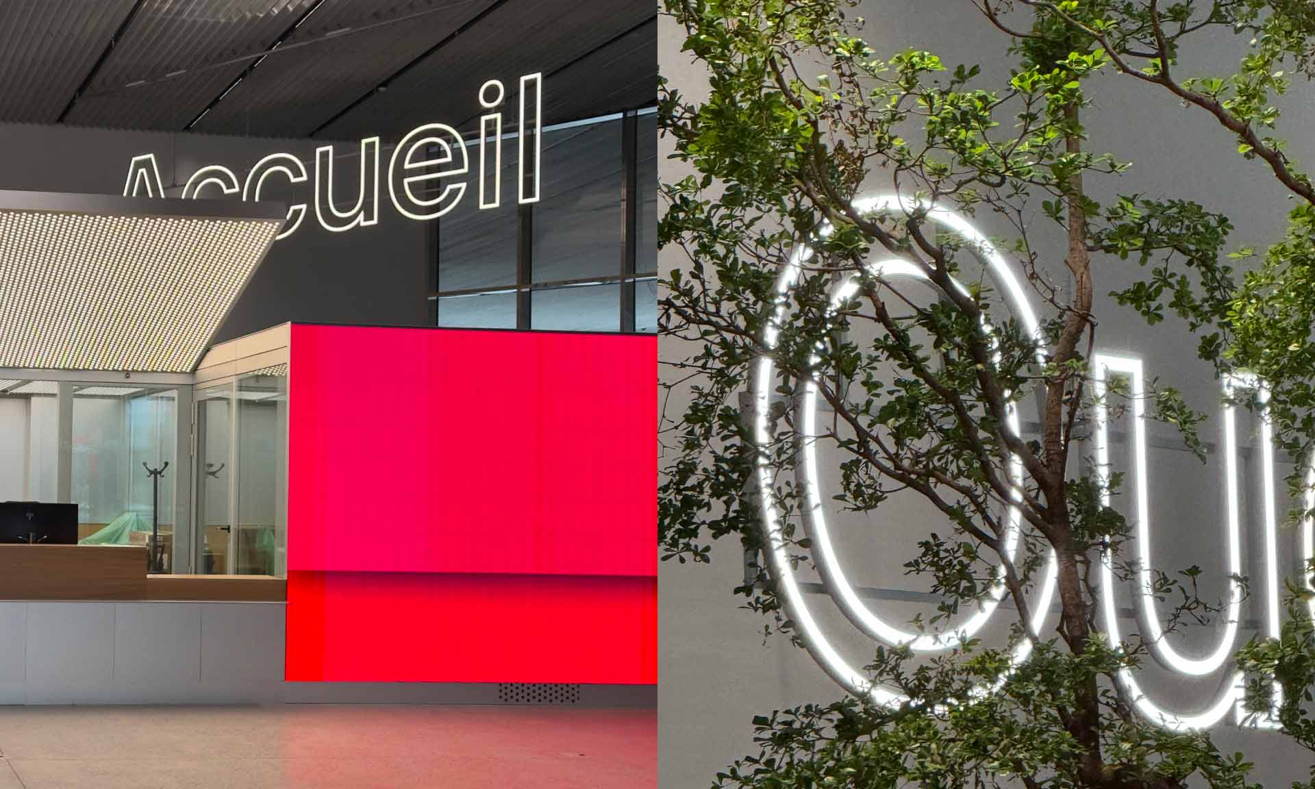
Hymn extended the brand identity into the building itself. The same typography, custom-drawnfor RTS. The same pictograms, the same codes seen on screen, carried over onto doors and pathways. The banner principle developed for the screens finds its physical equivalent: layered metal totems, translating into volume what once existed in motion. In the corridors, the signage stays understated, direct, efficient. In the grand hall and the open space, it changes scale: suspended illuminated signs dress the space and guide from a distance. Same logic, two intensities. The materials, in turn, speak the same language as the building: steel, natural aluminium, technique left exposed. The brand doesn't sit on top of the place. It lives in it.