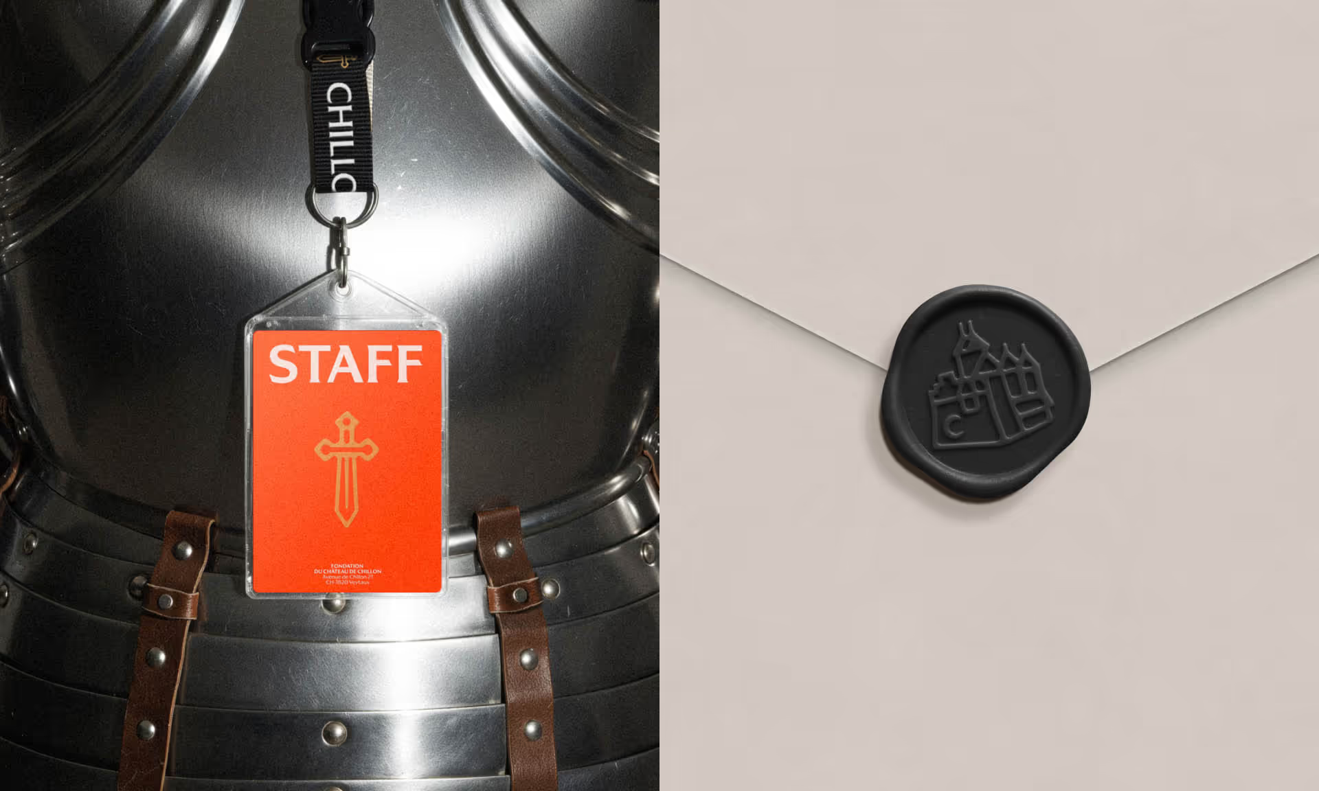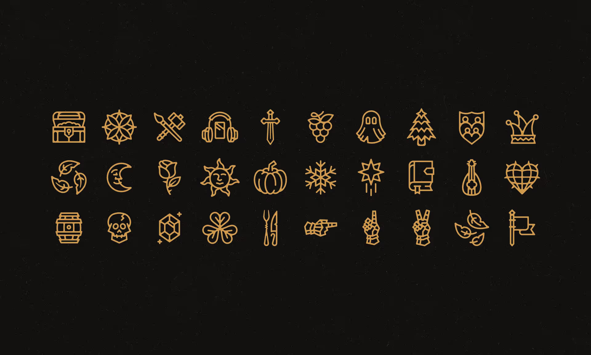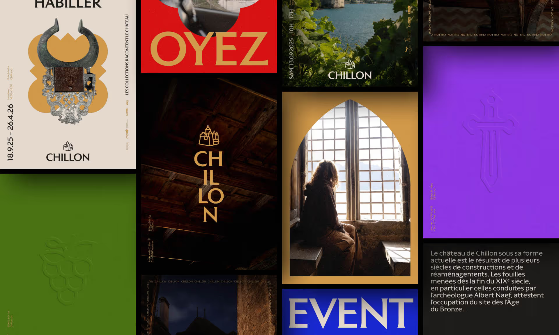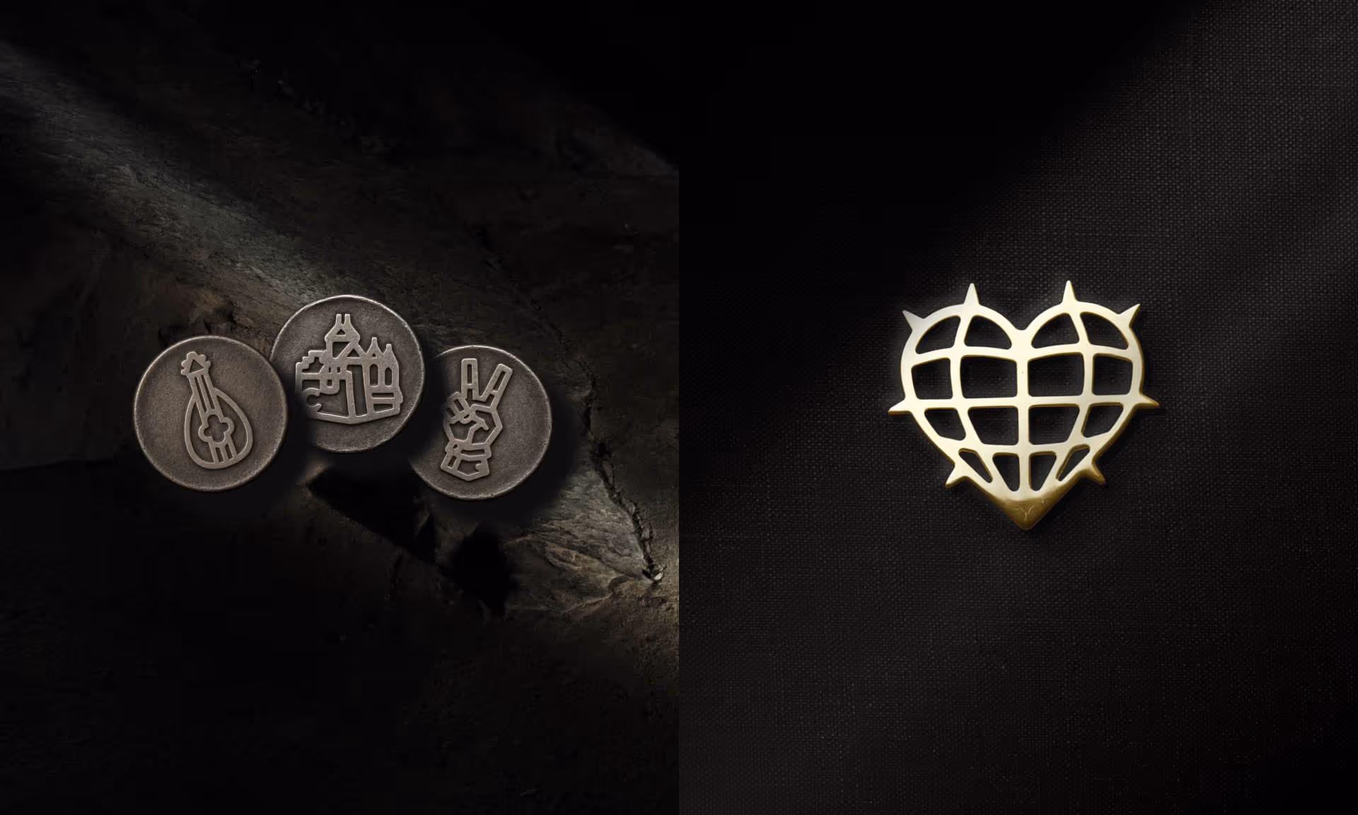
Contemporary Medieval
Branding
Strategy
Brand communication
Digital experiences
data-impact="stat"
data-impact="title"
data-impact="description"
{ "active": true, "cards": [ { "stat": "+10%", "title": "Customers", "description": "Increased customer base and brand engagement." }, { "stat": "+40%", "title": "Internal Engagement", "description": "Strengthened employee engagement and sense of belonging." }, { "stat": "+72,5%", "title": "Uniqueness & Accuracy", "description": "Significantly improved brand image alignment." }, { "stat": "+45%", "title": "Visibility", "description": "Notable improvement in brand visibility." }, { "stat": "+62,5%", "title": "Strategic Clarity", "description": "Significant clarification of the brand strategy." } ]
}