Context
Etienne, John, and Christian are three highly experienced private bankers who are specialists in the financial industry, having worked with some the world’s largest and most prestigious institutions. Because they believe their clients’ legacies require bespoke services, tailored to each individual, the trio decided to launch their own family office: Spring. Built to reflect their values of collectivity, scalability, high performance, and exclusivity, the team at Spring manages large family heritages as if they were their own. They tasked Hymn with developing an authentic brand identity, one that would relay their uniqueness in the industry while seamlessly embodying both family and financial values.
Challenge
Our initial challenge was to reconcile elements and values that at first glance seem to be in conflict with one another. As a company, Spring needed to be simultaneously bold and yet reassuring, simple and yet intimate; the company manages assets and estates but must be able to understand, anticipate, prepare for, and embrace the future. Spring’s services revolve around single axis, but the company is also ternary in nature, and the branding needed to express confidentiality while also leaving a powerful, lasting impression. So, we dove deep into our toolkit of typefaces, words, shapes, colours, and animations to develop a powerful and ever-changing custom concept for Spring.
Services
Naming
Brand Identity
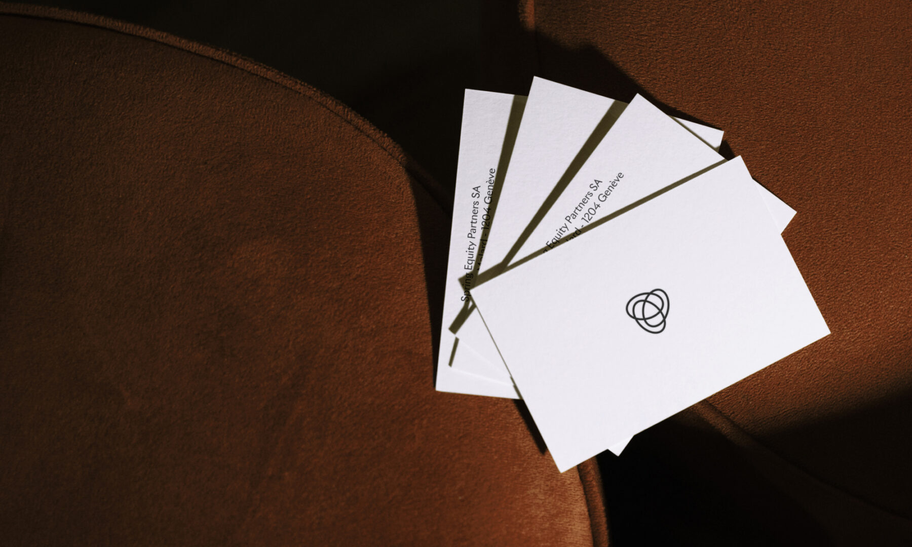
Printed Collaterals
Web Design
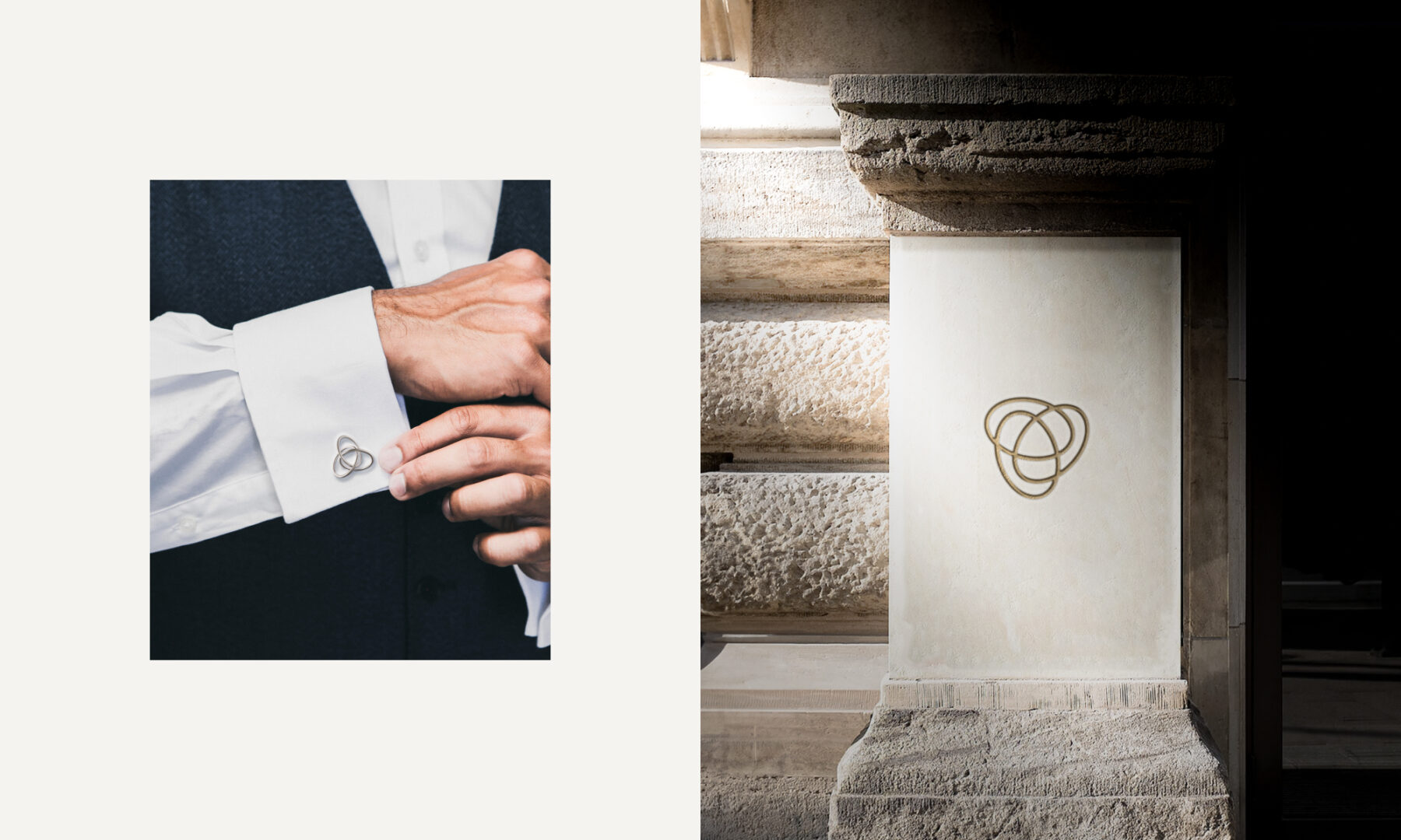
Signage Design
Motion Design
Client
Spring Equity Partners
Solution
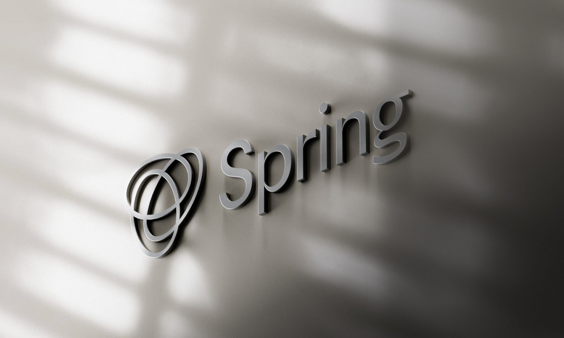
The creative world of nature felt like the perfect starting point for Spring and formed the basis of all the brand’s graphic elements. The rings represent the three associates, their personalities, their similarities, and their differences. These iconic symbols also embody the oneness of family and the eras that define it: past, present, and future. When animated, these three rings form a flower in a state of perpetual bloom.
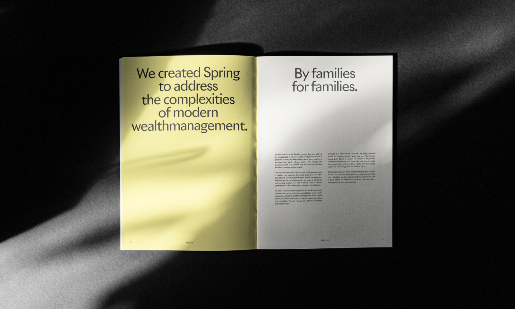
The chosen typeface is Riviera, fitting because it was designed by three well-known typographers at SwissTypefaces, who took the 100-year-old British font and gave it a “Swiss-touch” refresh. Many of the typeface’s key characteristics have been preserved, like its vertically cut lines and pointed peaks, but the essence of the font has also been infused with a style that’s resolutely Romand-Swiss, striking a perfect balance between classicism and modernity.
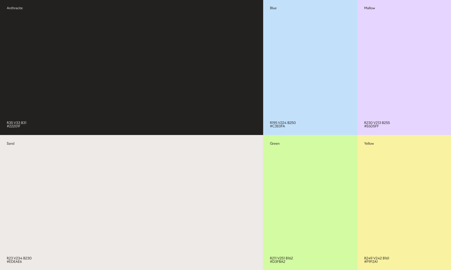
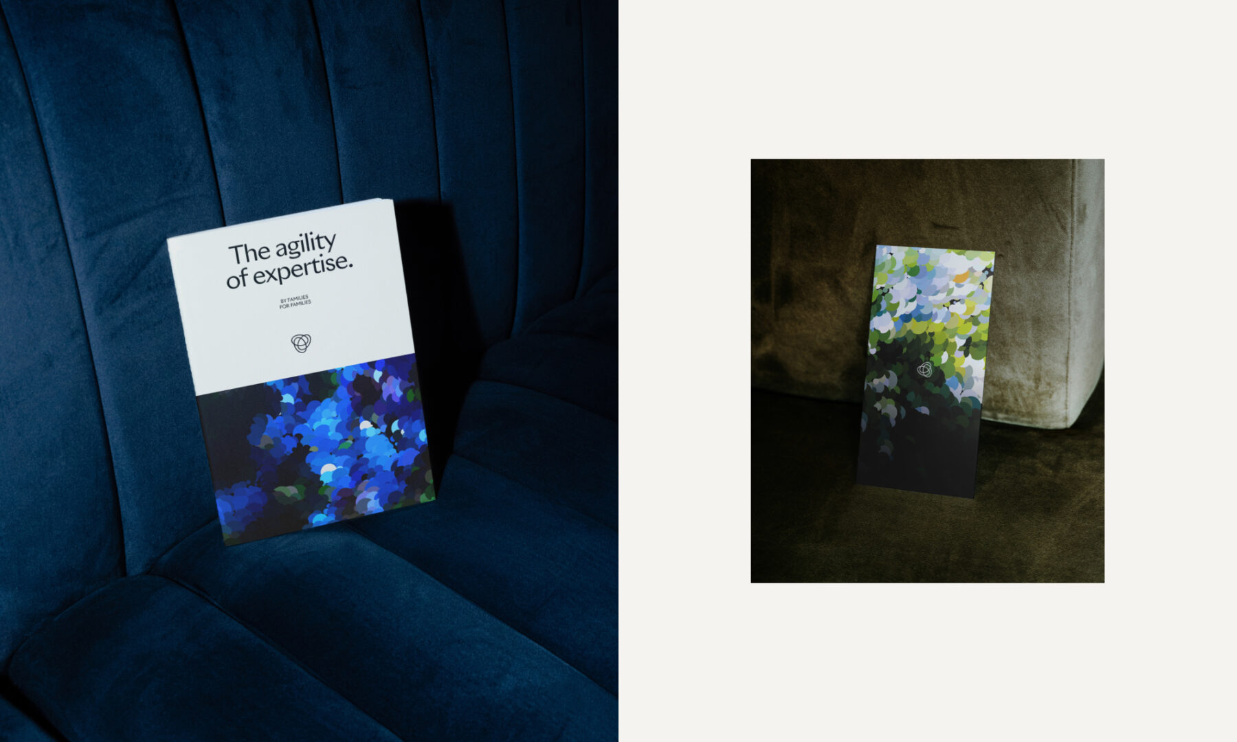
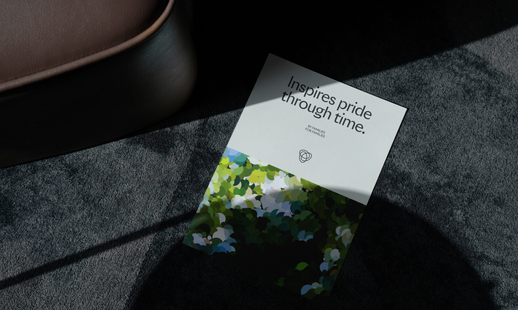
The visual identity developed by Hymn acts as a kind of interface between the worlds of classical painting and generative art. This association allows for an infinite number of variations using our unique design as the visual foundation and then letting the data define the rest. The colour tones, compositions, and dimensions are not pre-defined, so the digital half-tone dots can generate an innumerable variety of floral animations that adapt to the client’s wishes. In addition to creating a strong logo and brand identity, the flowers also act as an artistic interpretation of the brand. These pointillism-inspired bouquets will brighten their offices, lending themselves to wall art, the pages of their website, or even the back side of their business cards. They are simple, progressive, surprising, and yet also assertive; a perfect embodiment of Spring.
Milestones
- Create a strong brand identity for a one-of-a-kind family office
- Harmoniously unite seemingly opposing elements and values
- Use nature as inspiration to create a fluid, visual foundation that can be used across physical and digital formats
- Develop a dedicated artistic universe that can be refreshed easily at any time
- Build a financial brand that stands out in the industry
- Use data to design innovative visuals
- Develop unique graphic works inspired by the company branding
Want to talk about your next challenge?
→ Let's get in touch
++
Hymn Design Sàrl
Rue de Lausanne 64
1020 Renens — Switzerland
