Context
It is unique in Switzerland. It shines a spotlight on everything from marbles, pawns, dice, cards, and the board games of yesteryear, to the controllers, joysticks, pixels, and video games of today. Welcome to the Swiss Museum of Games (Musée Suisse de Jeu, or MSJ) – the Mecca of games, if you will – which boasts eight rooms exclusively dedicated to the history of games. The museum has everything going for it, including a stunning location on the banks of Lake Geneva, where it has been housed in the castle of La Tour-de-Peilz since its founding in 1987. In 2023, Selim Krichane stepped in as the new Director and kicked off rebranding to revitalize the museum in a game-changing way.
Challenge
While the theme was certainly meant to be playful, the rules of this rebranding game were strict. Our mission’s first task was to create an identity that evoked a universe of games without relying on any single game as a muse. That meant excluding cards, chess pieces, checkers, dominos, Monopoly tokens, Scrabble tiles or any other famous contemporary game elements. Our proposals needed to be timeless yet simple and easy to understand by a diverse audience ages 3-99 years old. Secondly, instead of a traditional logo, the museum was looking for a visual identity that could be adjusted for multiple internal teams and for multiple formats – like a custom (Hymn-designed) version of Tetris.
Services
Brand Identity
Printed Collaterals
Web Design
Signage Design
Motion Design
Client
Musée Suisse du Jeu
Solution
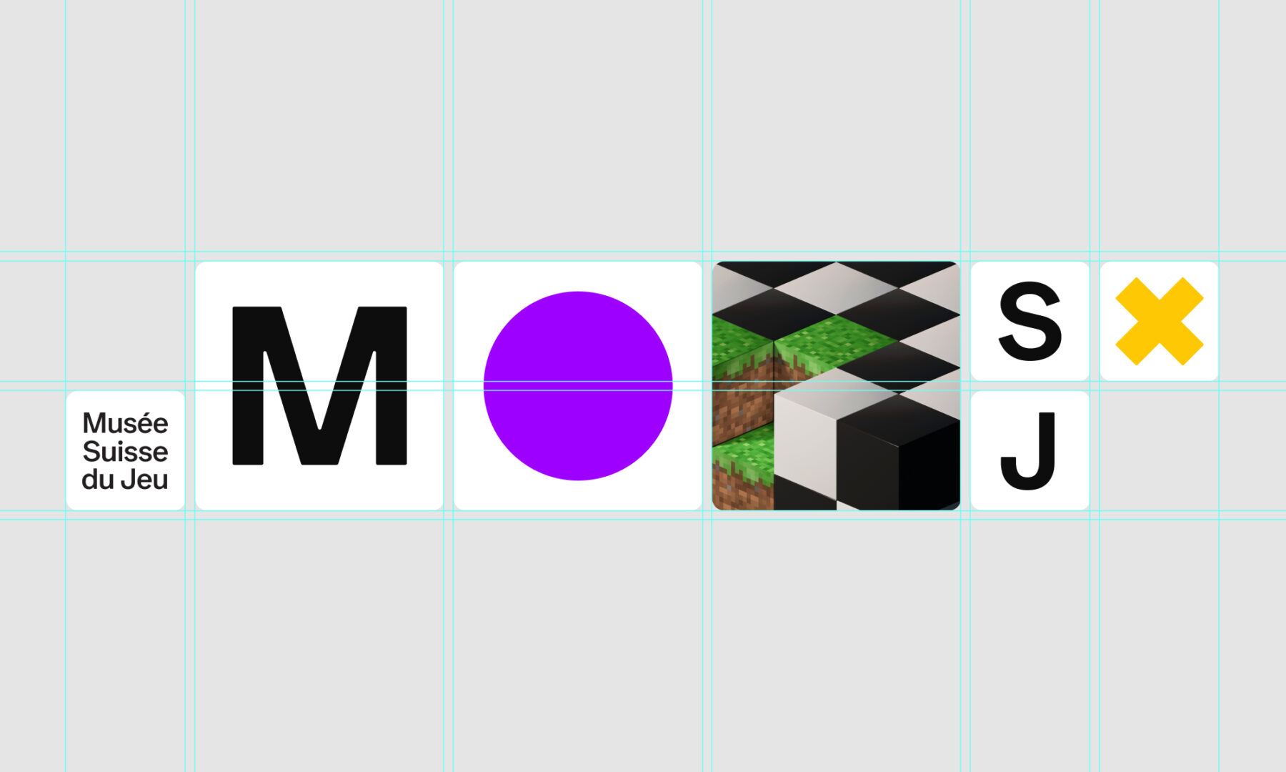
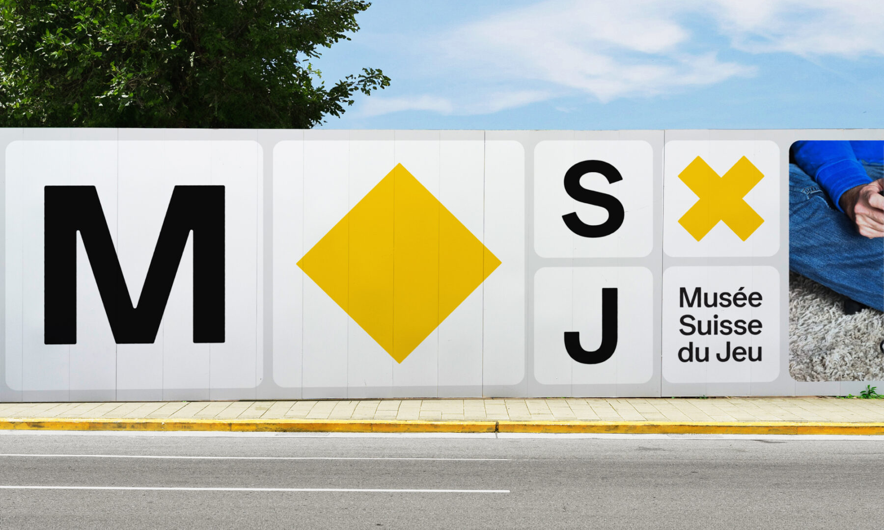
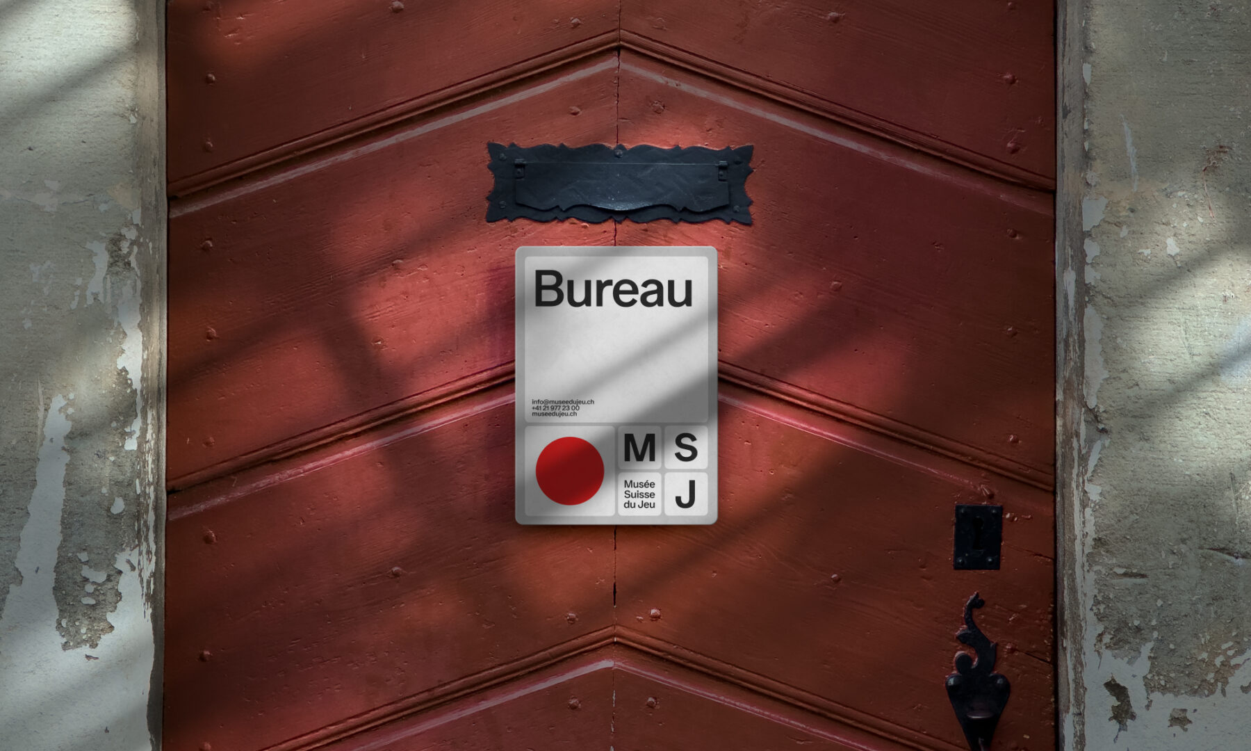
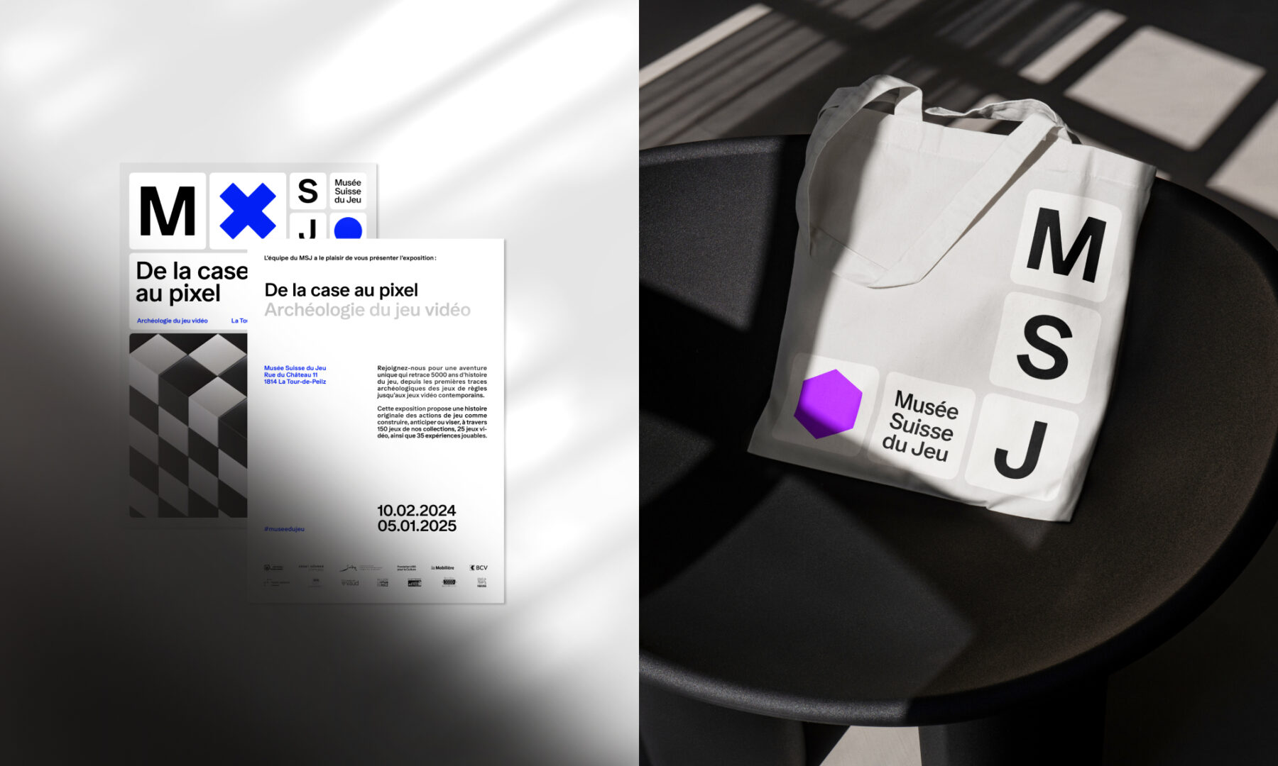
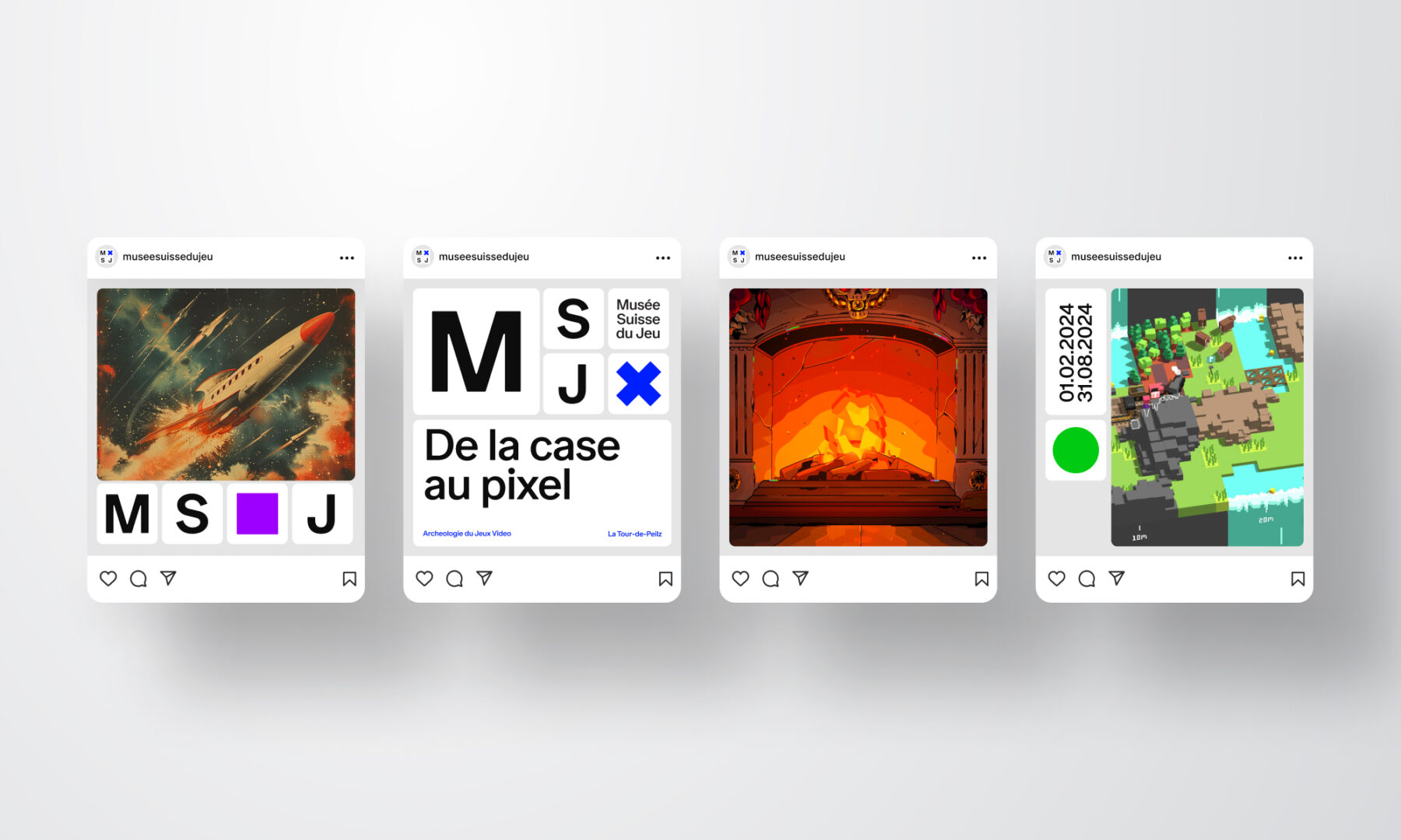
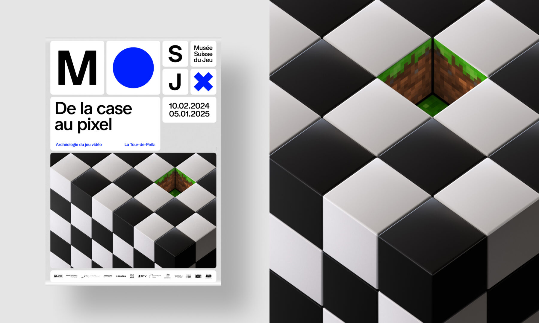
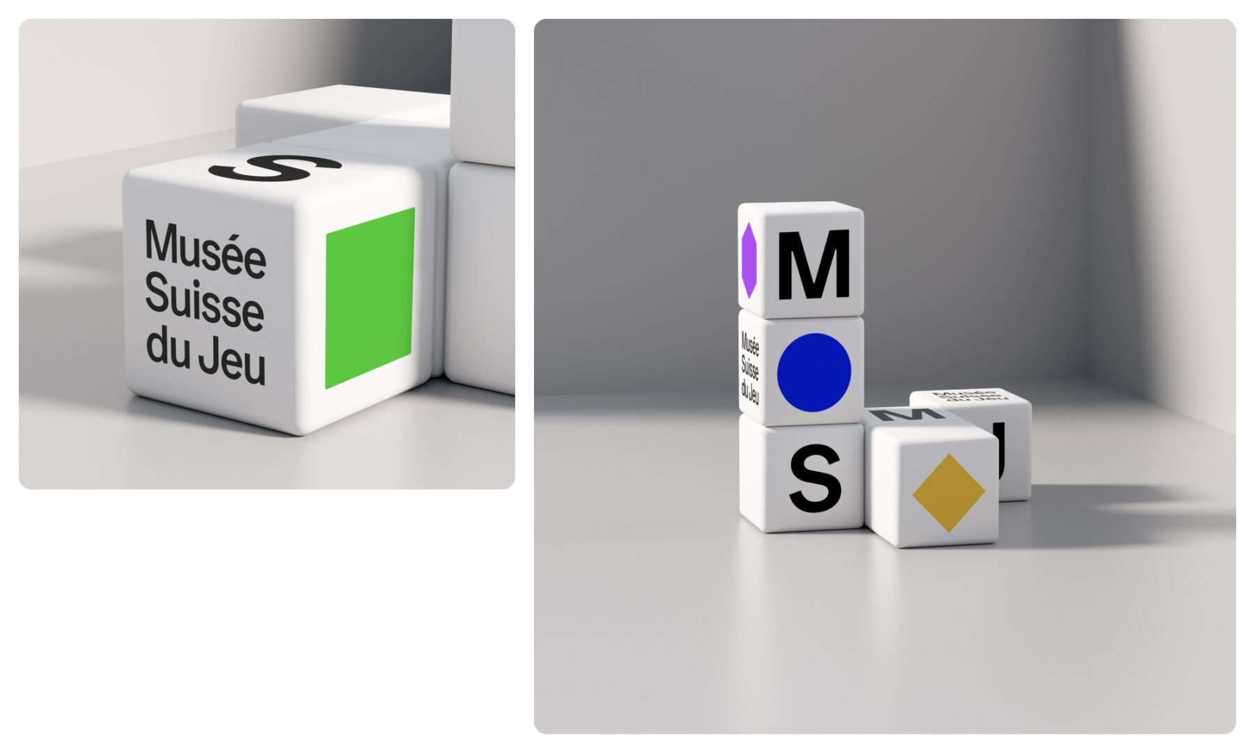
Our proposal was largely inspired by tabletop games. On the board, we set up a variety of white tokens with rounded edges. Some of the tokens display geometric shapes that echo iconic game symbols and colours. Others display the museum’s French-language monogram: M, S, and J (Musée Suisse de Jeu). Using this base, the museum’s visual universe unfolds as a series of movable and interlinking tiles displaying the six different geometric shapes and letters.
The writing is now on the wall, and the possibilities for different combinations are endless. The token shapes can align horizontally and vertically, which means the letters, colours, and shapes can be arranged in any way – with no pre-determined rules. This playful approach offers an experience that’s always fresh, captivating, and immersive. It can be used for static channels like print and signage, and can also dynamically adapt to animated channels like the website, social media or digital signage. The ball is in the museum’s court to play with their logo and reinvent themselves over and over as they see fit.
To compliment this visual design, we chose a simple and highly readable typography (font Ease). Simultaneously contemporary and timeless, it boasts the look and feel of Helvetica with a bit more roundness, and as requested by the museum, it was of course designed by a Swiss type foundry (Studio Feixen).
Milestones
- Revitalize a cultural institution in the Canton of Vaud and give it a fresh, contemporary edge
- Modernize the museum’s brand identity in a highly readable and playful way using timeless visual cues from games
- Create a versatile and distinct visual system that the client can learn to use and manage on their own
Want to talk about your next challenge?
→ Let's get in touch
++
Hymn Design Sàrl
Rue de Lausanne 64
1020 Renens — Switzerland