Context
RTS (Radio Télévision Suisse) is Switzerland’s public broadcasting organisation for French language content. It is made up of two television stations, four radio stations, a website, numerous apps, and a host of flagship programs. While the company’s three letter acronym is well-known throughout the country, its brand identity has become largely institutionalized by radical shifts in media consumption. RTS has found itself in a constant state of reinvention, particularly in response to the explosive growth of digital formats. No department was left untouched, as new options for channels, content, cadences, and media preferences emerged, began to overlap, and at times worked in competition with one another, creating distance with their very own parent company. This was the context that drove RTS to put out a call for proposals – from which Hymn was selected as the partner – for developing a powerful and unique brand for this iconic Swiss company and its new branded platform.
Services
Strategy
Naming
Brand Identity
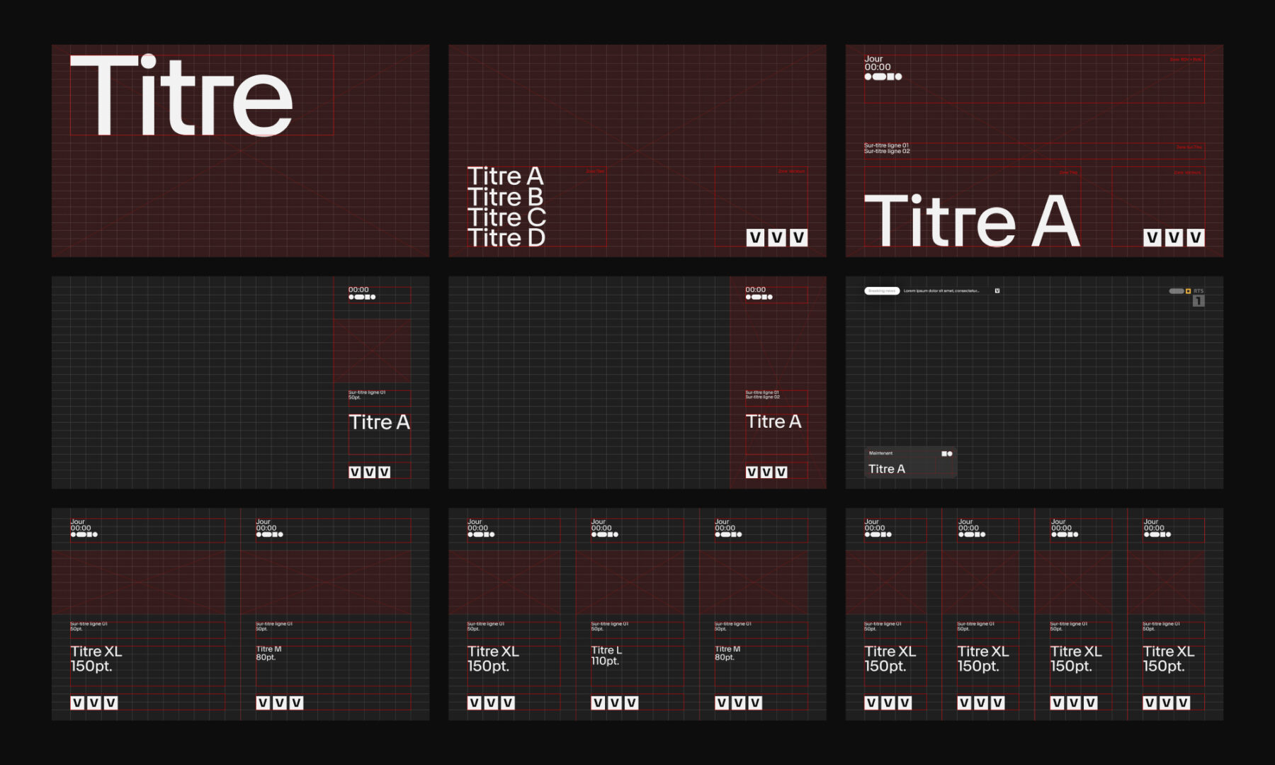
Design System
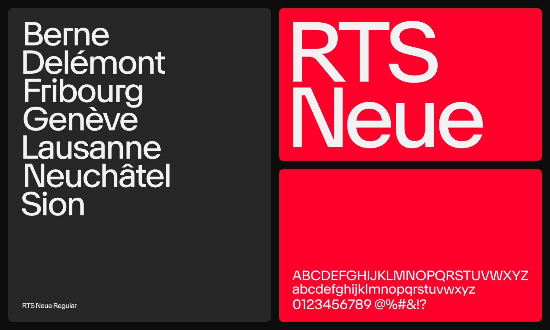
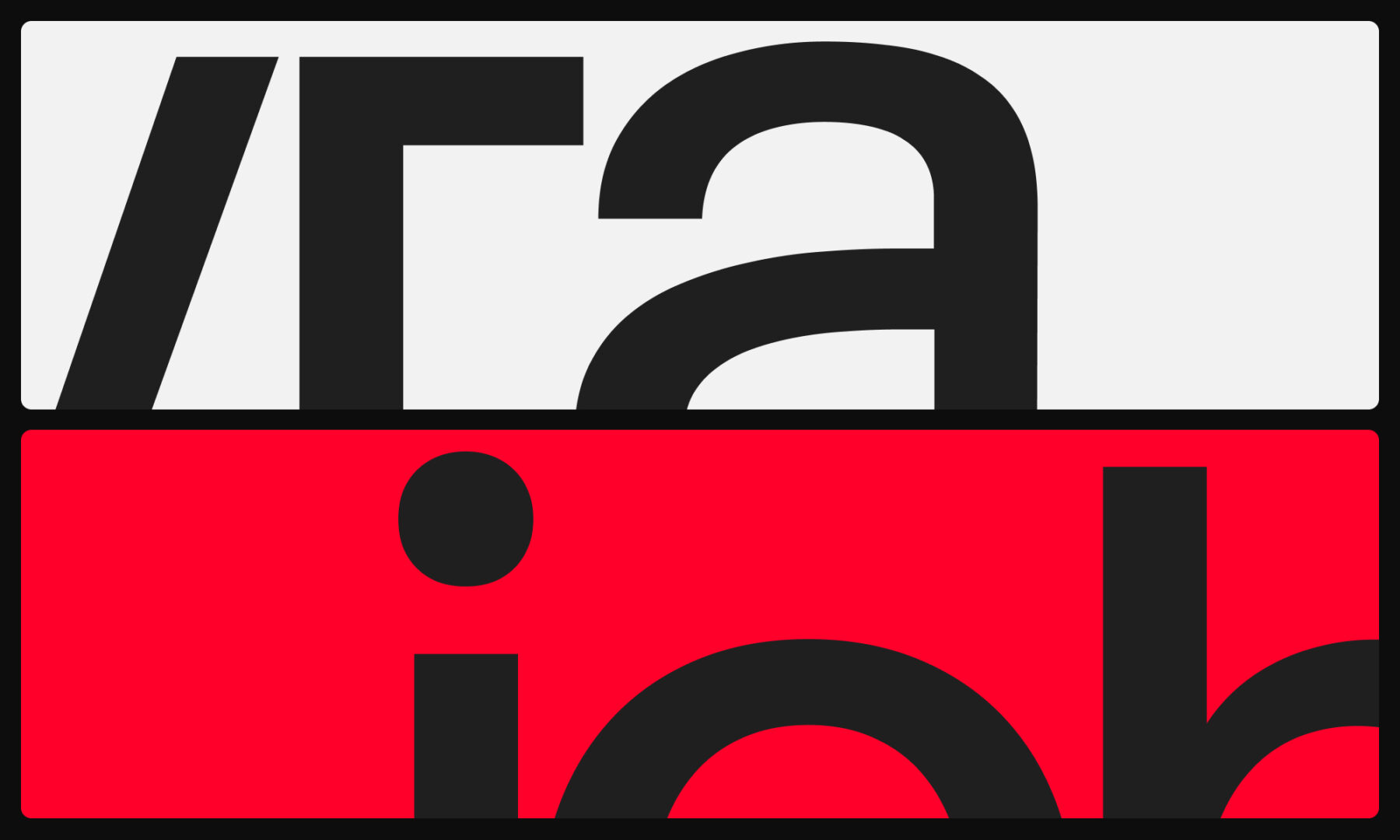
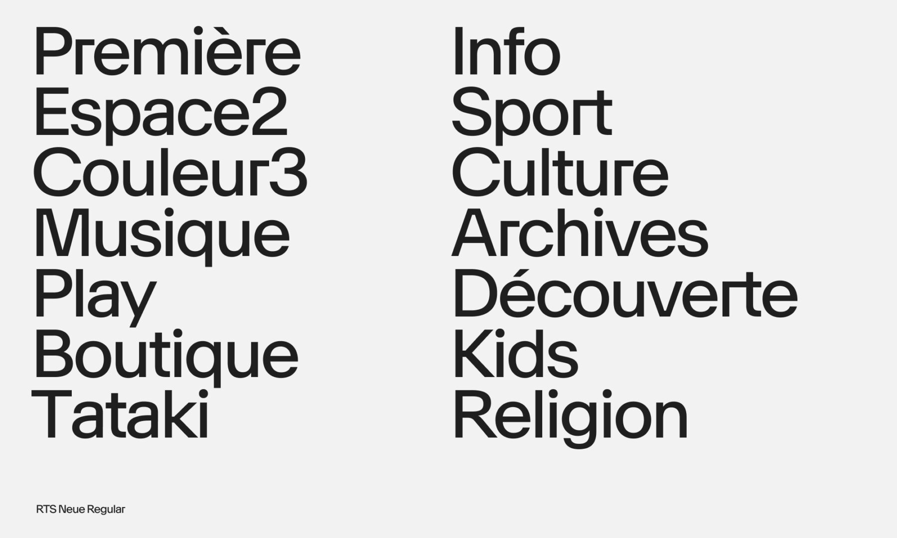
Bespoke Typeface
Printed Collaterals
Motion Design
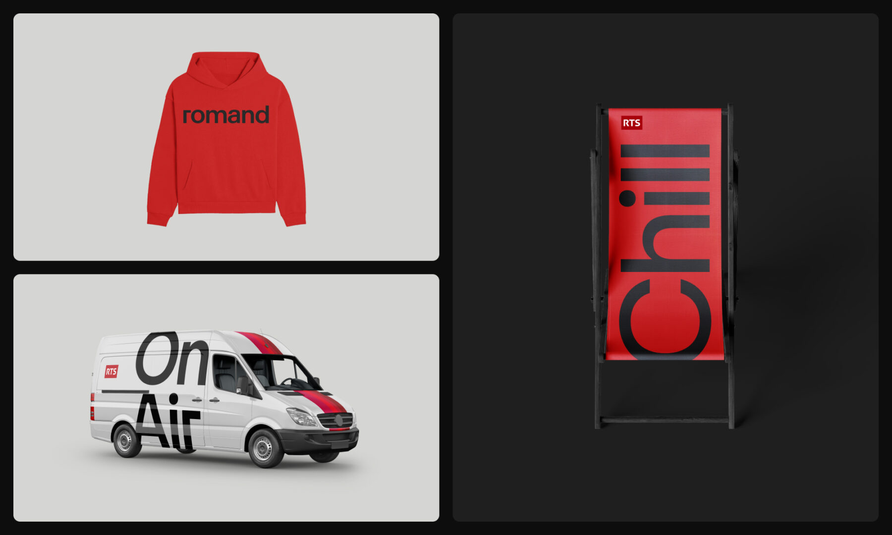
Merchandising
Sound Design
Credits
RTS Internal Teams
NewGlyph (Type Design)
Sandor (Sound Design)
Client
RTS
Challenge
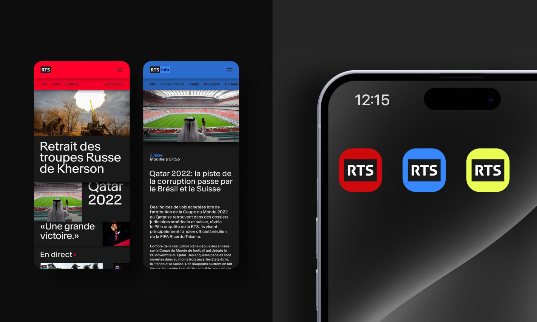
Our challenge was to maintain the original logo (which is part of parent company SSR) while also uniting RTS’ collection of different brands under a singular identity. We were asked to develop a clear hierarchy; update baselines, values, and emotions; maintain an essential “Swissness;” and offer a variety of controlled possibilities for growth over time. In addition, every channel’s logos, labels, graphic identities, on-air corporate designs, and promotional and marketing support channels also needed to be seamlessly woven into this fiery mix. All while bringing a touch of boldness and a breath of fresh air to the table, of course. In short, we had to ensure we covered every component and that our proposal solidified the brand’s presence in the current landscape while also giving the company the flexibility and freedom to adapt to ever-changing future possibilities.
Solution
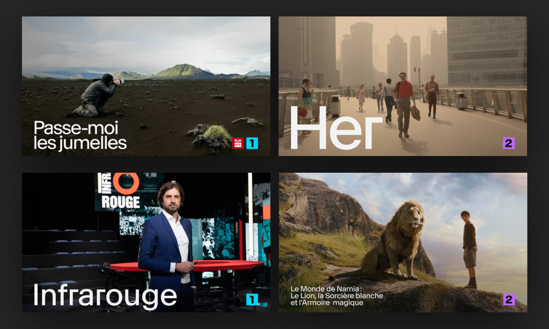
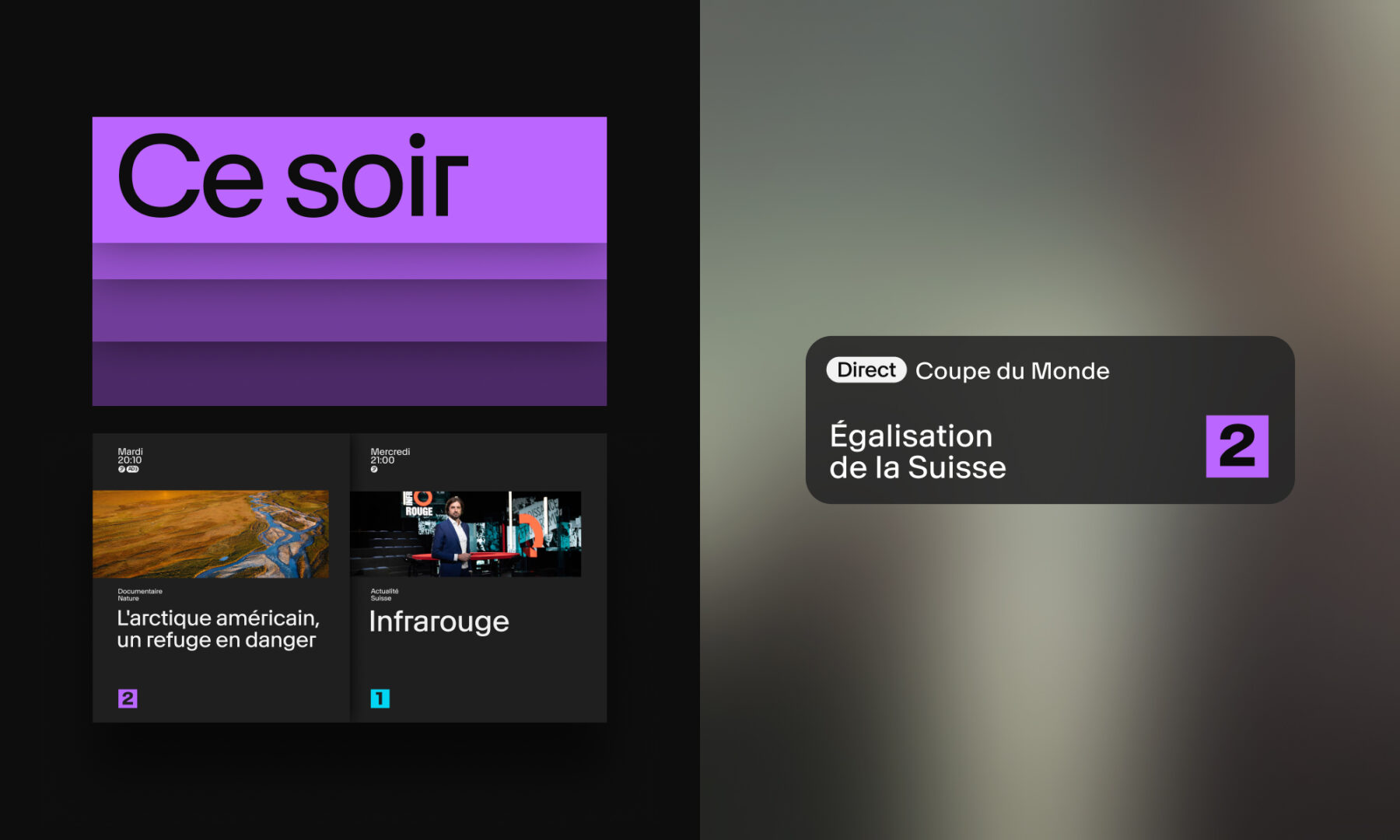
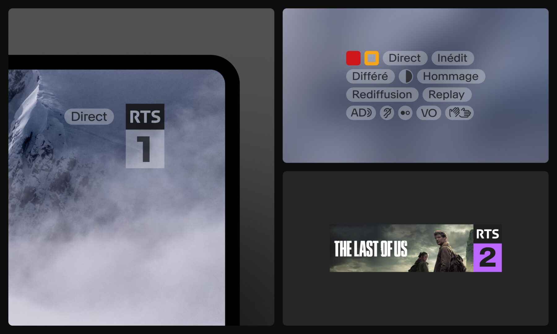
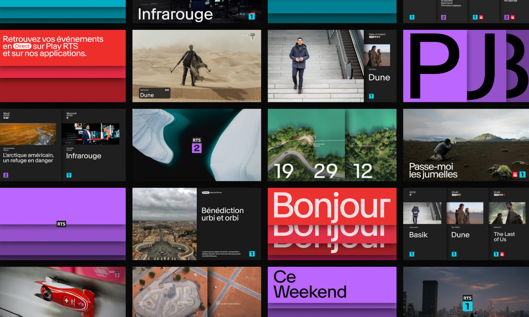
Hymn’s solution allows RTS to express its unique and diverse identity through a simple yet cross-functional concept that revolves around a single element: the RTS logo. But – as is so often the case – that simplicity is the result of a complex, uncompromising, and subtle combination of typography, colour, animation, visual and audio associations, and (perhaps most importantly) dynamic storytelling.
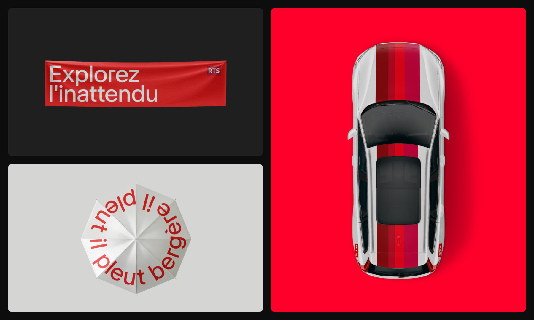
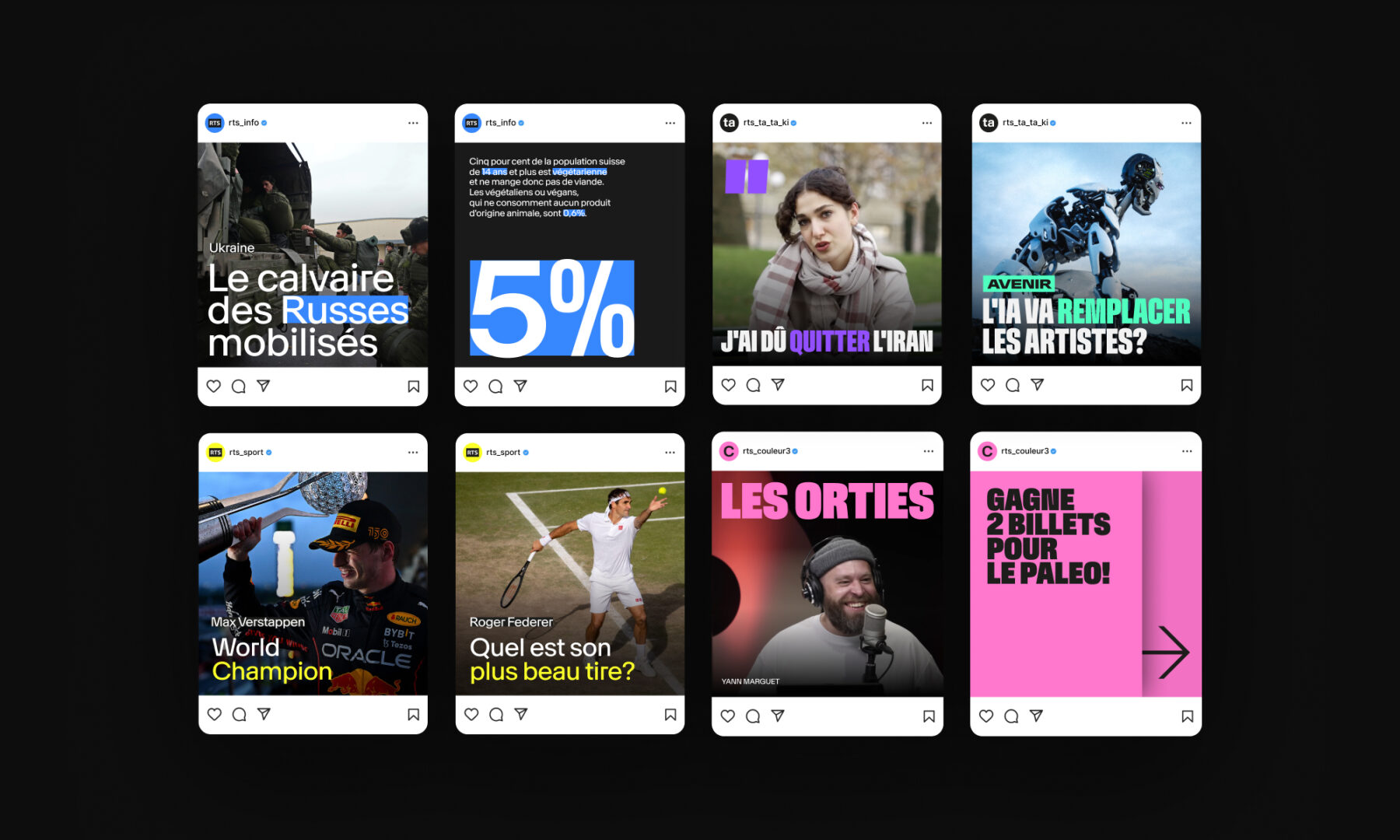
When it comes to the typography, we sought to embrace both the unique and the “industry acceptable.” Through a collaboration with Ian Party (from the Swiss type design studio NewGlyph), we developed RTS Neue, which is as much Swiss-Romand as it is atypical audacity. This typeface was thoroughly studied, dissected, and reassembled, embracing both the rounded and the sharp for ultimate ergonomics in every curve, joint, and angle. The result is well-defined, readable, and easy on the eyes. The colour palette continues that same flow in rich, vibrant reds that work as well on screen as they do out-of-home. The auditory components are bespoke, created by Swiss-Romand composer and interpreter SANDOR to perfectly compliment the other design elements.
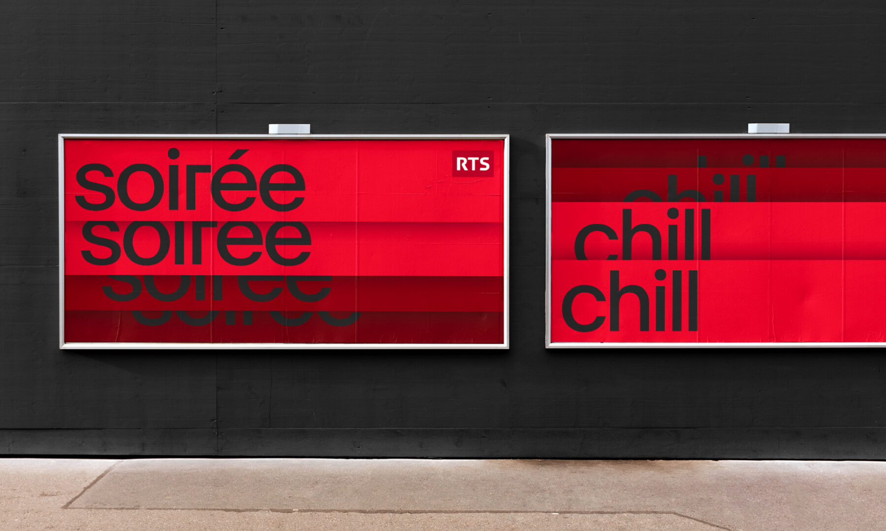
The concept’s taxonomy was the final touch needed to redefine the new brand identity. Built around two strong axes, all content unfolds either vertically or horizontally. The vertical axis represents the channels while the horizontal axis represents the themes, allowing for almost infinite variations within the two layers. The entire concept is instantly readable and echoes the rich diversity of the RTS universe. Like a deck of cards that unfolds from side to side, or from top to bottom, viewers can easily navigate the same concept across both broadcast and digital channels.
Going from theory to final implementation was just a single step... and months of backend iterations. It goes (almost) without saying that the final rollout will take place gradually, given the size and scale of RTS and its many components.
Milestones
- Create a new visual identity system while maintaining the parent brand logo
- Develop a singular brand identity that does away with the previous brand hierarchy
- Offer an open, progressive, and variative solution
- Infuse bold, passionate, fresh, and serious values, all while celebrating a truly Swiss identity
- Embrace both digital and broadcast in one singular solution
Want to talk about your next challenge?
→ Let's get in touch
++
Hymn Design Sàrl
Rue de Lausanne 64
1020 Renens — Switzerland