Context
EVS, the company that distributes Nespresso Professional products (among others) in the Vancouver area, was launching a new water brand for the Canadian market.
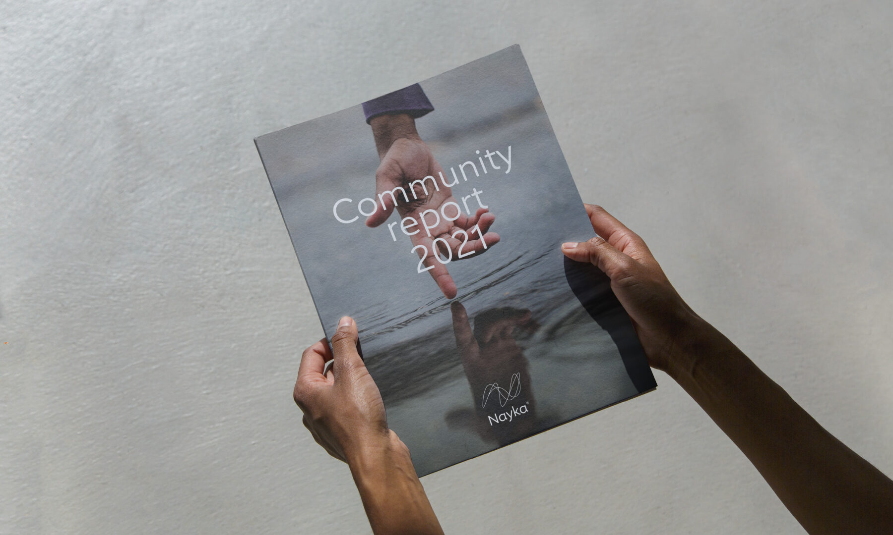
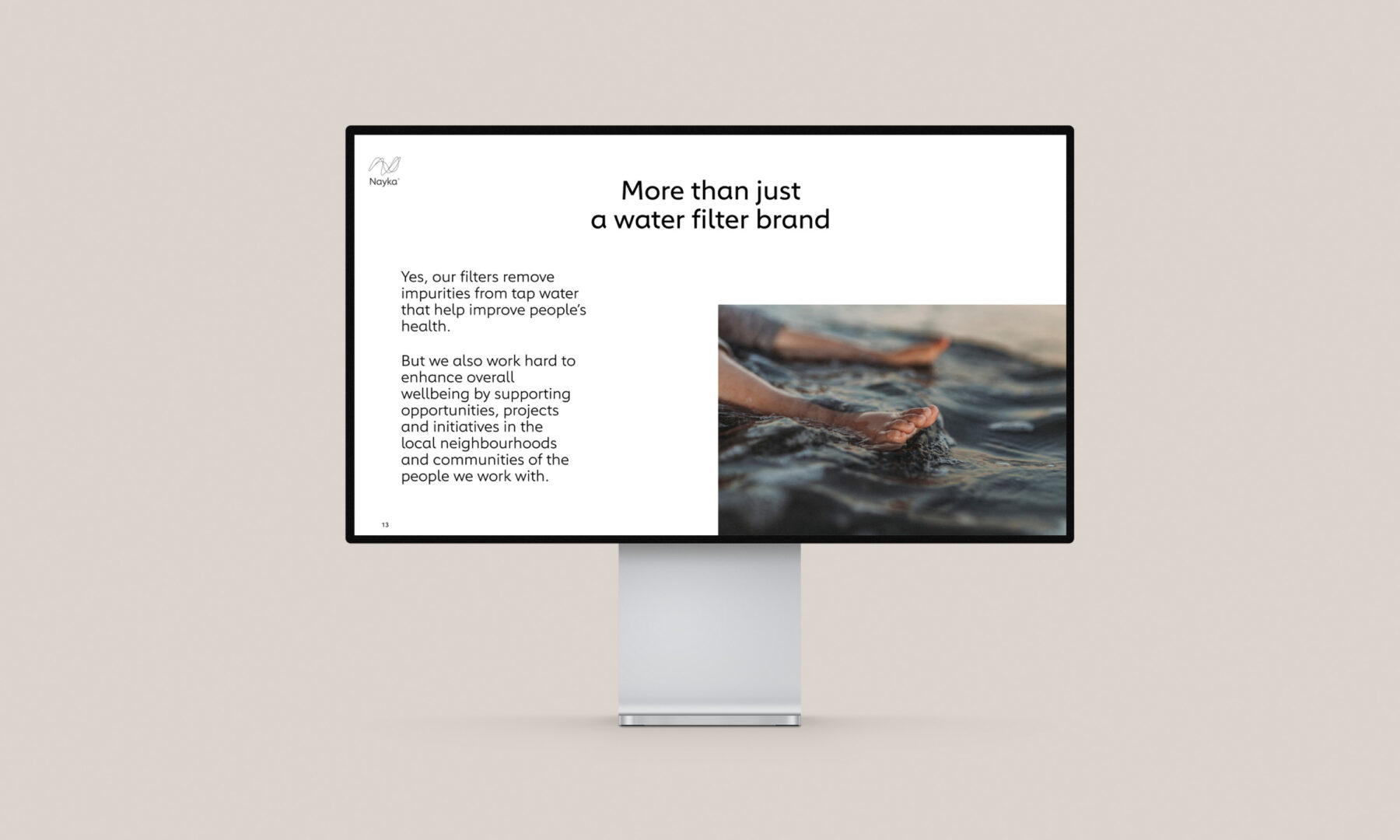
But Nayka was not just another branded bottled water with a fancy label; in fact, it’s just the opposite! Nayka is a plastic-free filtration system that’s designed to be an environmentally conscious solution for better drinking water. That philosophy is ingrained in everything the brand does, including its collaborations with local environmental projects, like river clean ups.
Challenge
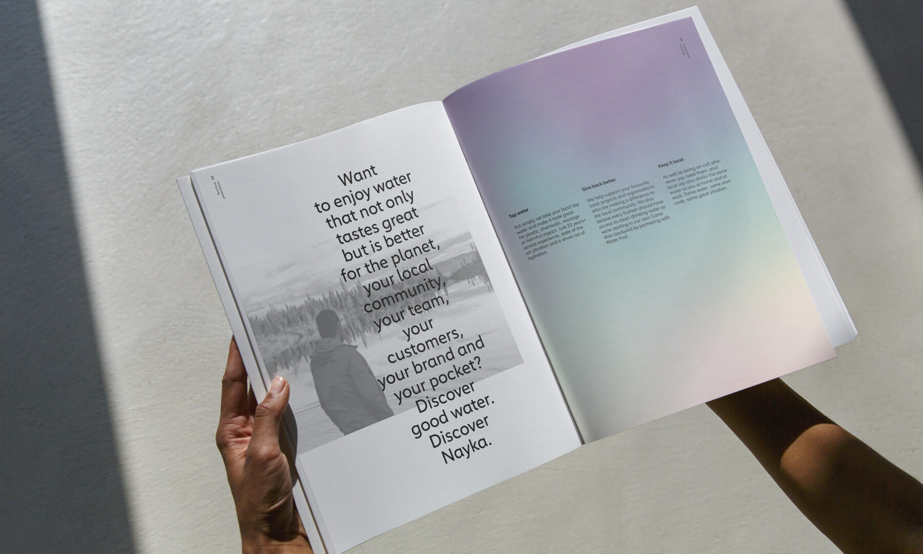
It quickly became obvious to us that Nayka was much more than a simple tap water filtration system. A stroke of luck, because that market is extremely saturated and difficult to penetrate, much like the market for bottled water. To differentiate the brand, we shifted our focus from the actual product to the aspirational lifestyle and philosophical commitment it embodies.
We needed to create an identity that would set Nayka apart from other water brands while also reflecting its mission and commitments to a more community-based, ecological, and sustainable future. A virtuous approach, but we also couldn’t ignore the fact that Nayka’s technology brings added value to the planet’s abundant tap water resources. That very concrete offering would be the driving force for convincing consumers to embrace the responsible and sustainable lifestyle the brand symbolizes.
Client
Nayka
Services
Brand Identity
Printed Collaterals
Web Design
Advertising
Environmental Design
Merchandising
Solutions
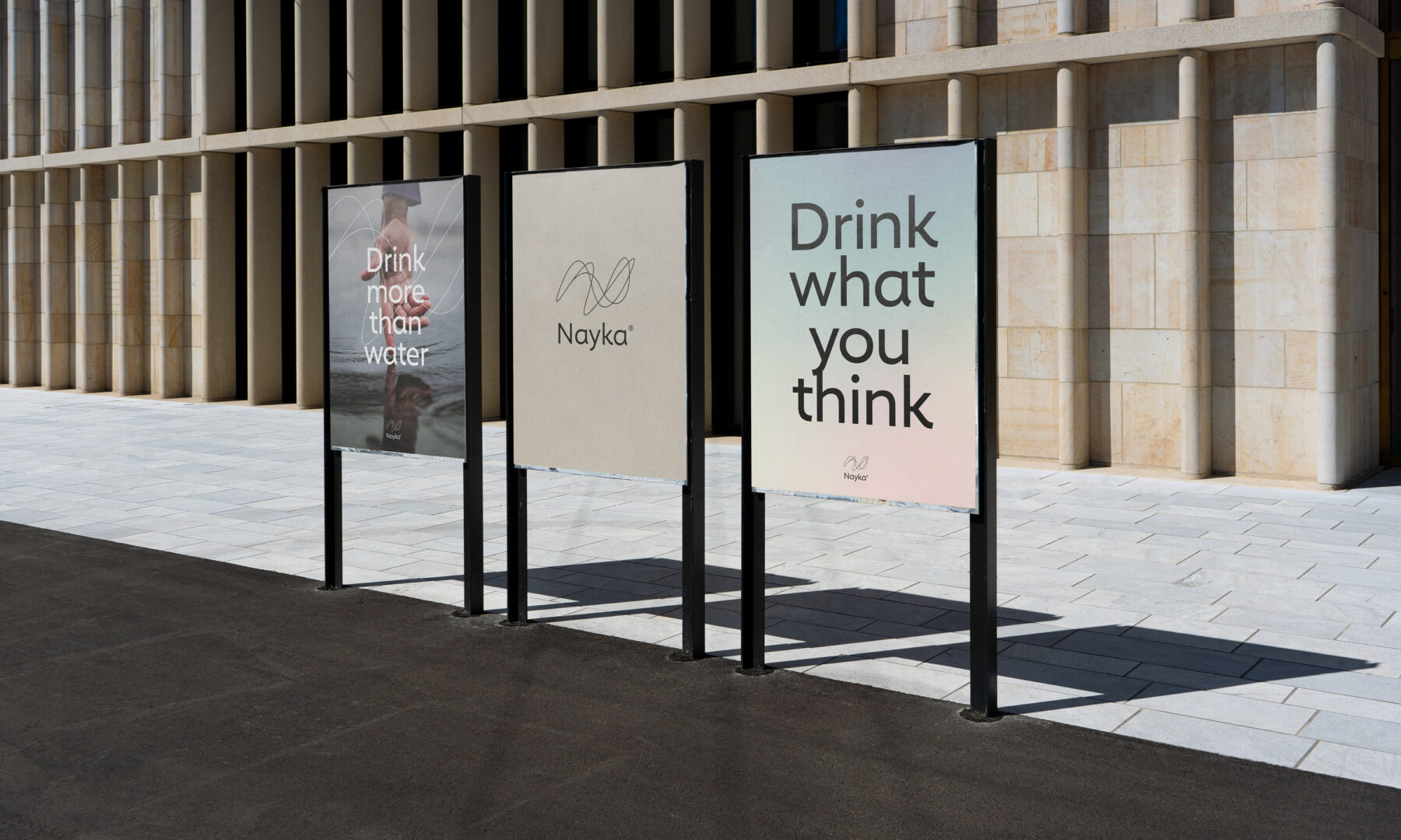
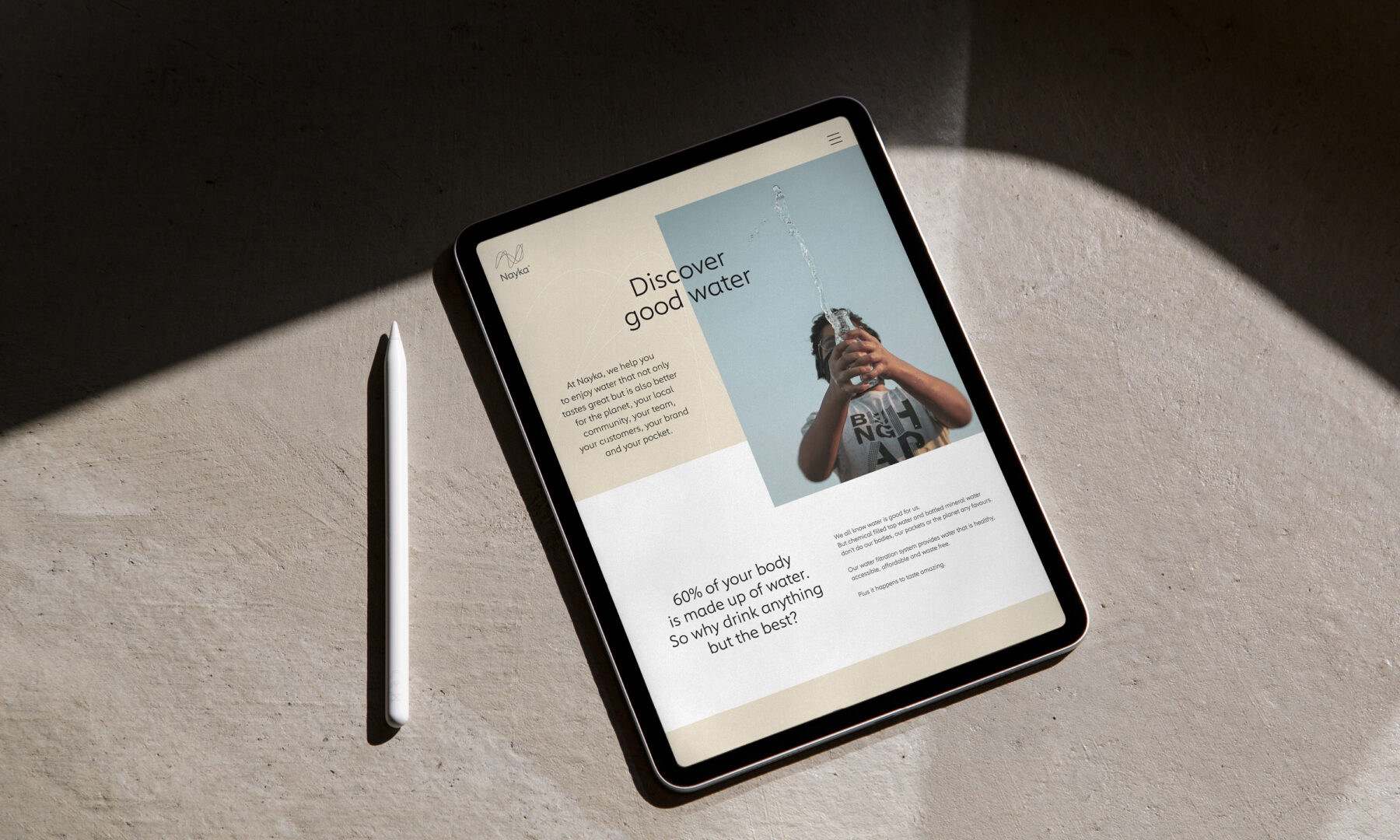
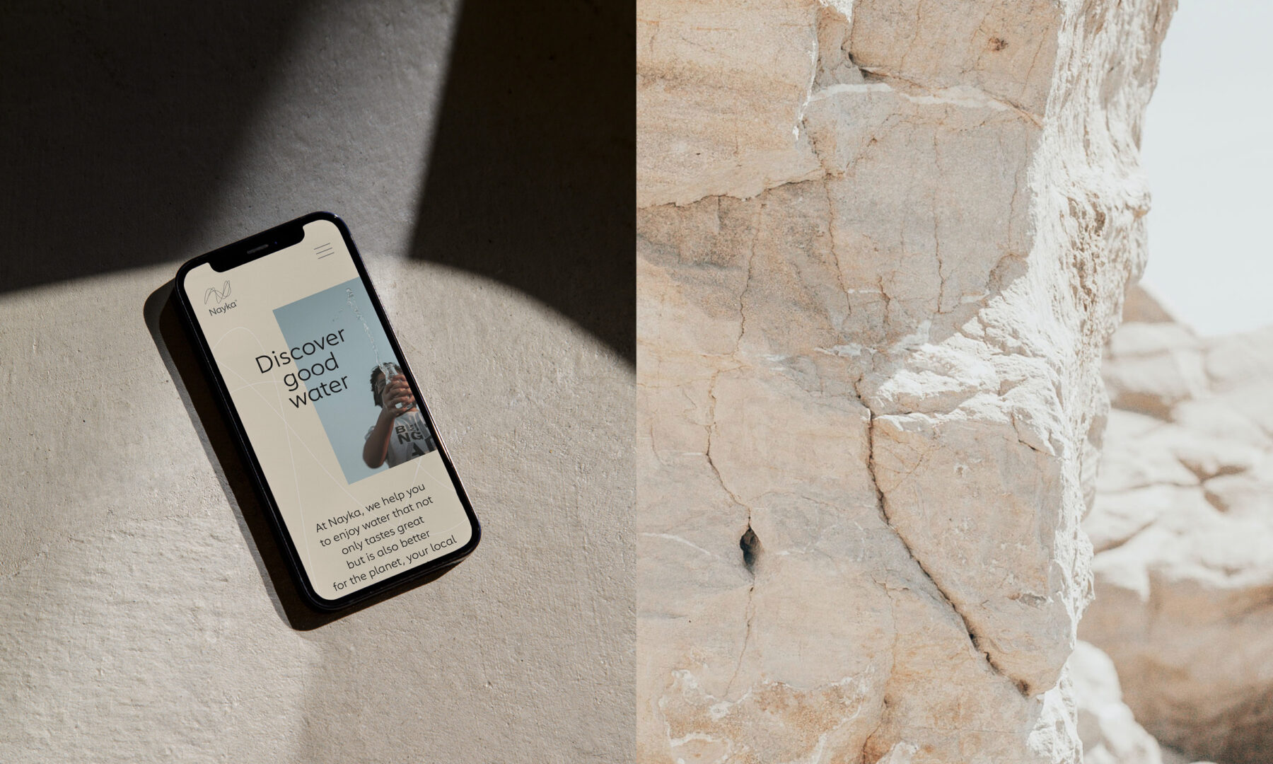
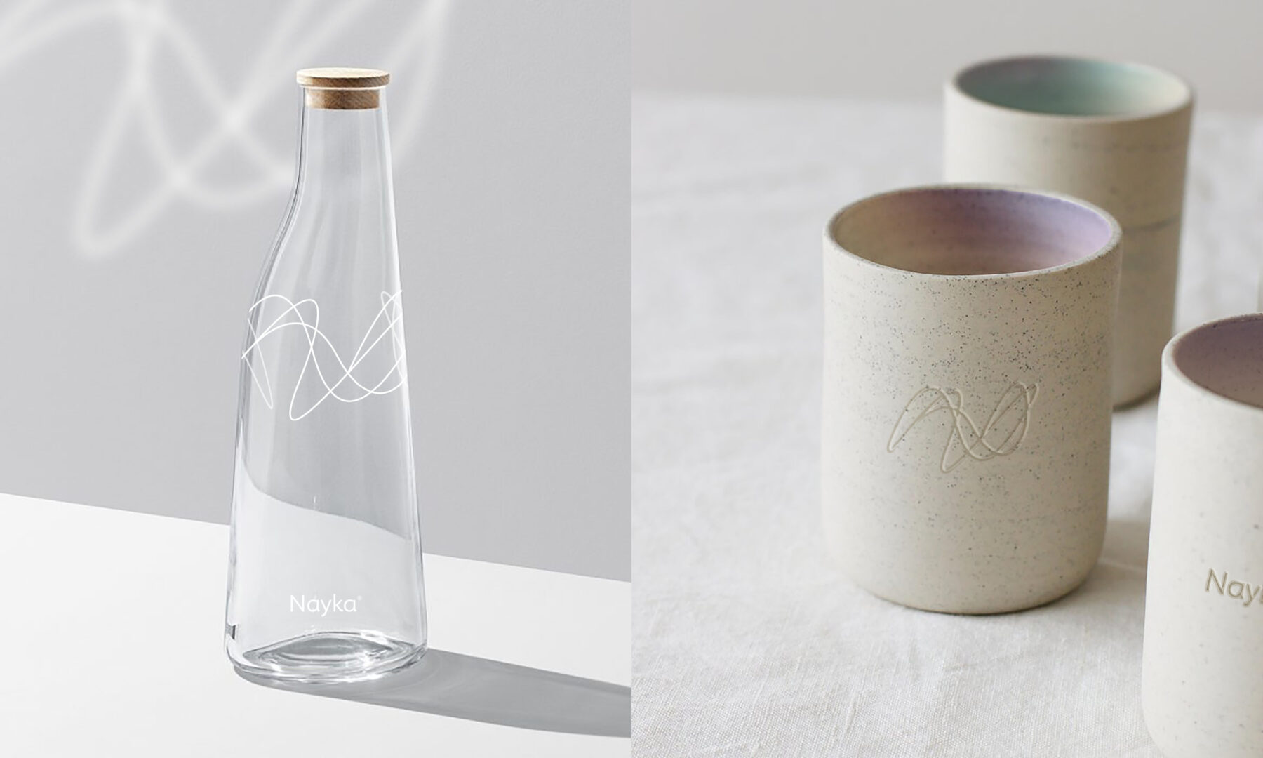
We developed a “reflections” concept that revolves around water’s literal reflections, in addition to the concept of self-reflection of our consumption patterns and their corresponding repercussions.
Since we couldn’t use the typically inspiring images of water sources, we chose to work with reflections in water and the magical projections they create when they interact with light. This allowed us to highlight the portability of tap water fluidly and poetically, brought to life in a mirrored reflection on a city cobblestone, across a smooth office desk, or sparkling on the cheek of a loved one.
This intellectual approach to the product enabled us to gracefully introduce the notion of responsible consumption, all while clearly differentiating Nayka from traditional water brand messaging.
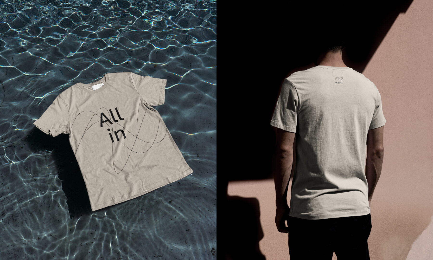
The visuals we developed further support our chosen philosophy. The logo illustrates the “N” in Nayka fluidly, as if through multiple reflections in water. This fluidity is carried through the chosen font, which is simultaneously soft and assertive. The colours and textures that make up Nayka’s visual universe are inspired by nature’s minerality, with references to the ruggedness of the earth, its clay, and its stone. The messaging ripples between the projects Nayka supports and the benefits of consuming water that’s different, healthy, respectful, and sustainable.
For the final touch, we added subtle hints of a rainbow filter here and there, to remind us of that elusive magic we feel when encountering water’s prism in nature.
Milestones
- Elevate the brand by associating it with a philosophy, an aspirational lifestyle, and a commitment to different consumption that’s healthy, more respectful of nature, and sustainable.
- Shine a spotlight on the brand’s commitment to local communities and its target audience.
- Highlight the value of drinking tap water, just like Nayka does.
- Create an innovative visual universe that doesn’t rely on images of water sources and instead focuses on the many fluid and magical reflections of water in our natural environment.
Want to talk about your next challenge?
→ Let's get in touch
++
Hymn Design Sàrl
Rue de Lausanne 64
1020 Renens — Switzerland