Context
Clinique Matignon is a leading name in aesthetic medicine in French-speaking Switzerland. With ten clinics, five capsules and over 50 possible treatments, it’s impossible to pass them by. Yet aesthetic treatments remain a relatively taboo topic in Switzerland. The group’s directors have been looking to change these preconceptions by taking a clear and ambitious approach to democratising aesthetic medicine. They recently decided to step it up a notch by encouraging people to not only openly accept it, but – even better – celebrate it! Hymn’s team was brought on board to help with the new positioning: goodbye old taboos and sterile environment, hello fun “love brand”!
Services
Strategy
Naming
Brand Identity
Design System
Printed Collaterals
Motion Design
Signage &
Environemental design
Merchandising
Credits
Guillaume Megevand (photography)
Client
MATIGNON
Challenge
Our mission was to find the perfect way to transform Clinique Matignon into a trendy, urban brand without losing sight of their highly specialized medial expertise. We were tasked with breathing fresh life into the brand while also highlighting everything they stood for; bringing in some colour while also embracing the seriousness of their classic black and white; and bringing their message to billboards for the first time without forgetting their values. The biggest challenge was figuring out how far we could push a new style without losing the brand’s identity, and how to balance the things we love about ourselves with the things we’d love to change.
Solution
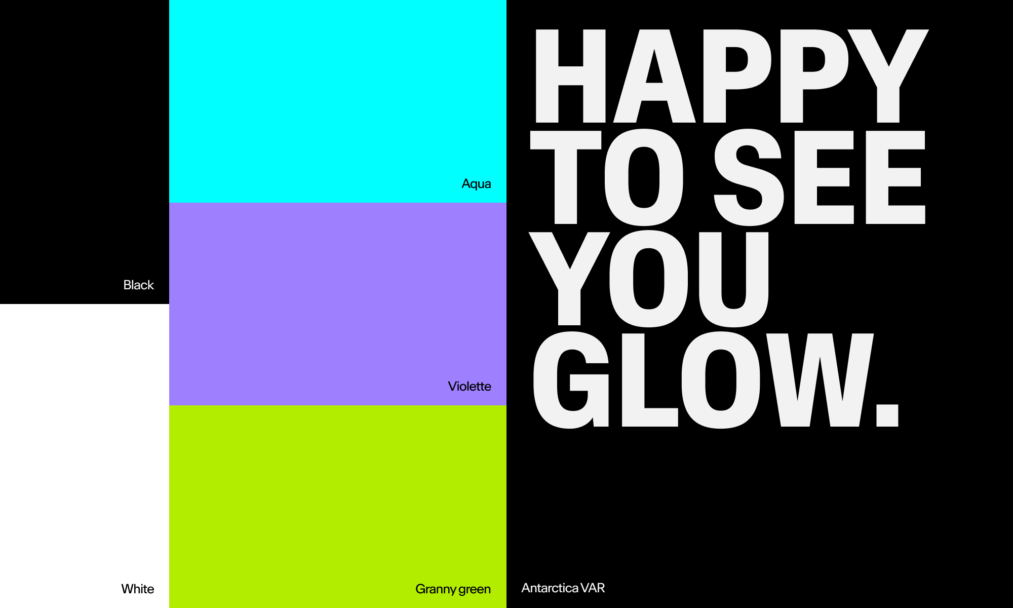
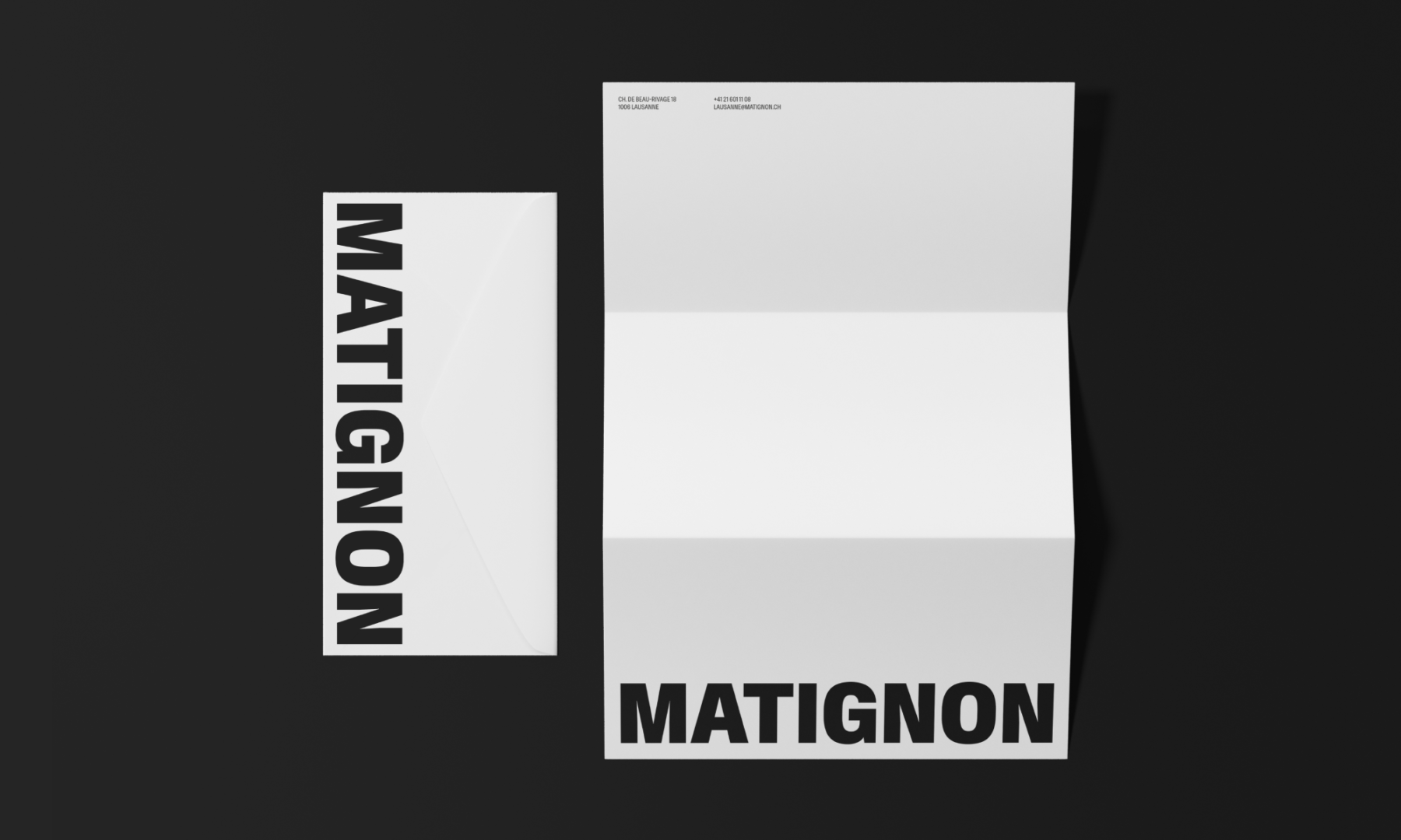
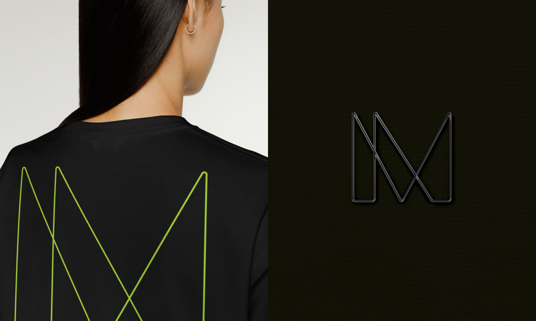
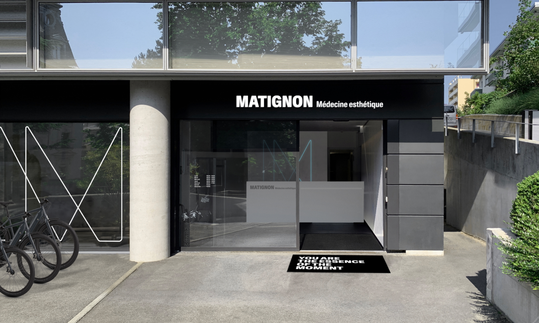
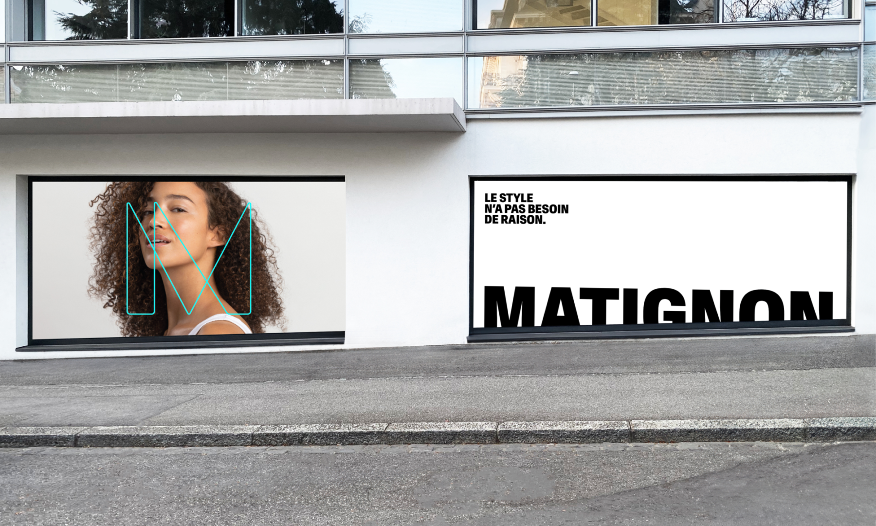
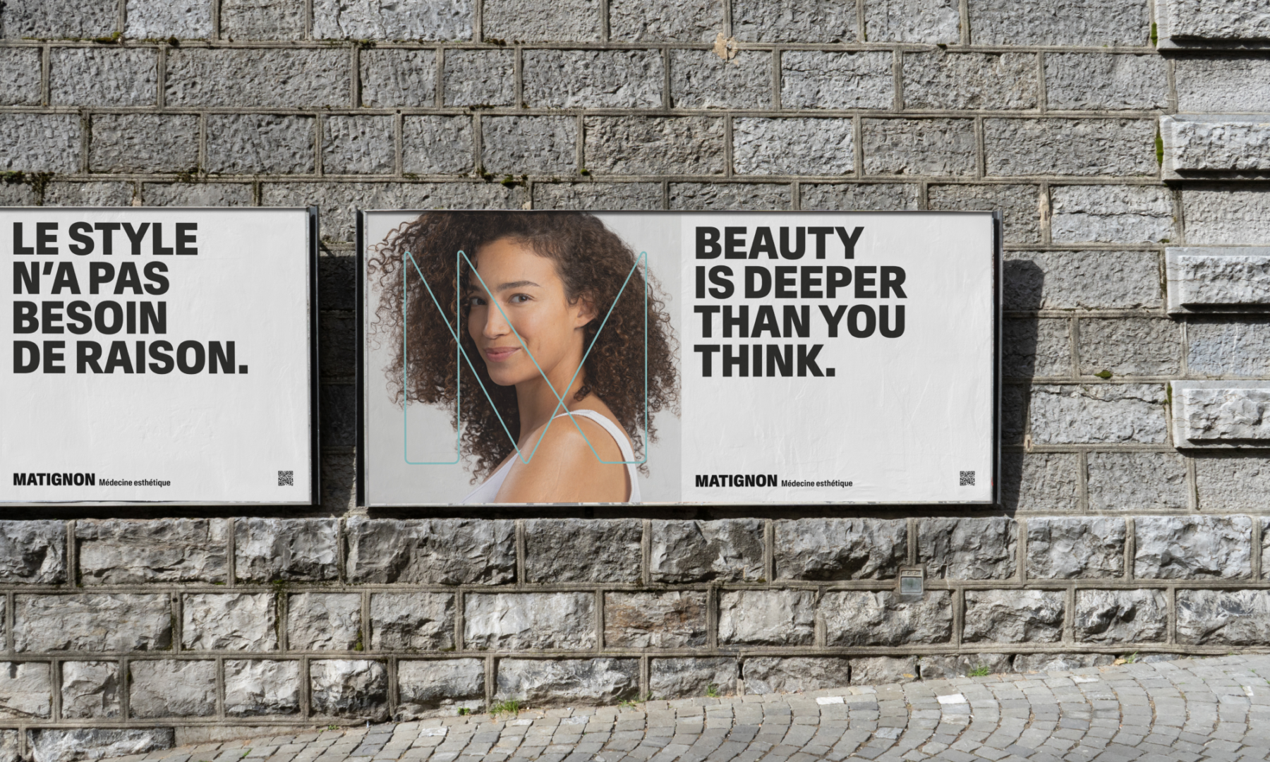
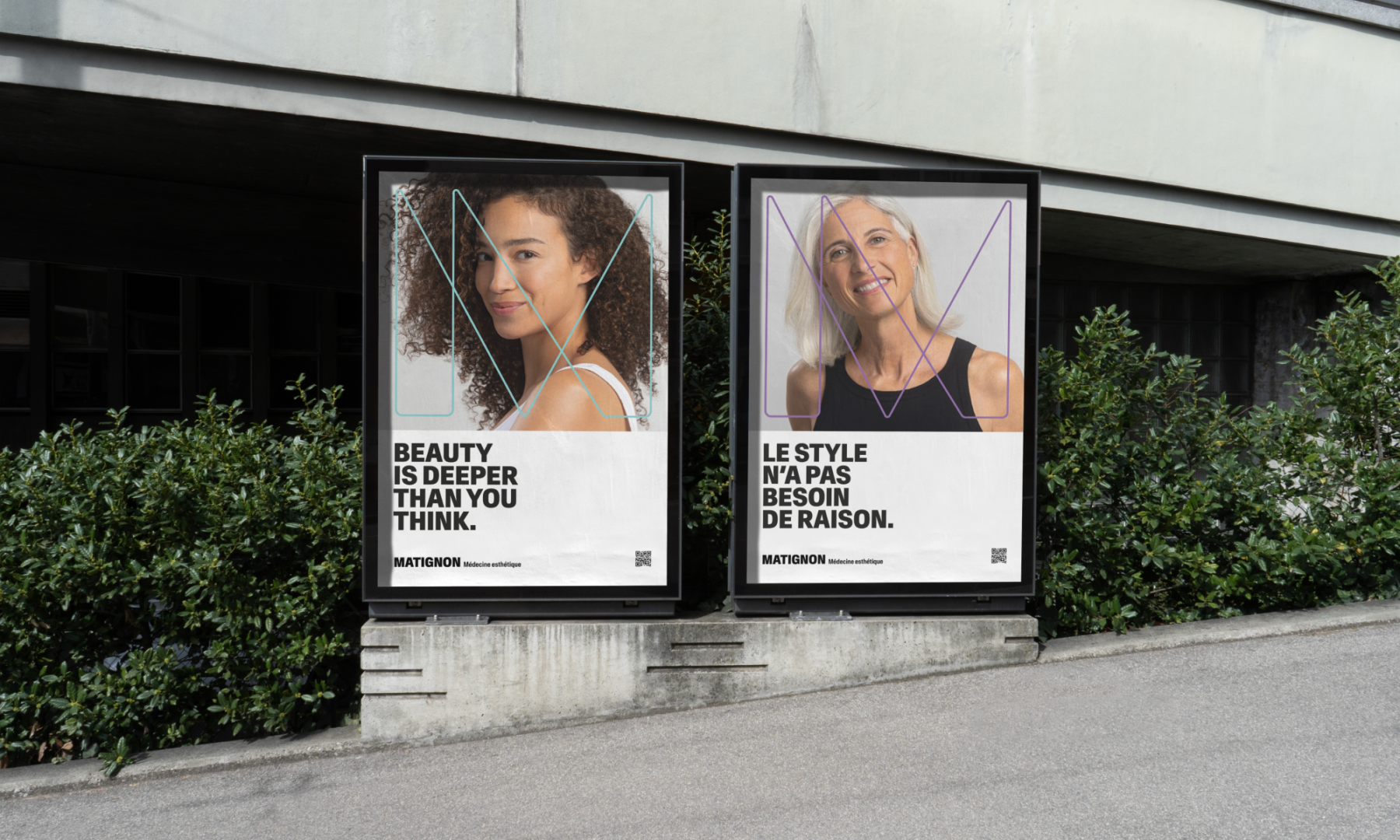
Before developing our full proposal, we sought inspiration from the graphic codes in ready-to-wear fashion, art galleries, hip cafés, and “love brands” – brands that have figured out how to foster extremely strong loyalty and love from their customers. Next, we took a deep dive into the company’s name, proposing the “Clinique” be dropped so that MATIGNON could shine confidently solo in bold capital lettering, using the typeface Antarctica (by newglyph). In some cases, the name is complimented by the industry-clarifying tagline “Médecine esthétique” (aesthetic medicine); other times it is reduced to a simple and straightforward monogram “M”.
The colour palette was also revisited. We kept the black and white as the dominant colours, but added an aqua blue, acid green, and bold lavender purple – three bright and vibrant new colours, which immediately brought a pop of modern brightness and a brand-new attitude to the table.
To ensure total coherence, we brought the new identity to life online, preparing a brand-new website and marketing campaign, while also developing new clinic signage, wall décor, custom-designed furniture, fresh uniforms, and updated branded merchandise. Every element combined seamlessly to highlight the brand’s classic purity, while also letting its true personality shine.
Before
Milestones
- Reposition the brand with a new visual identity that’s on-trend and inspired by “love brands”
- Rejuvenate the branding, bringing in an element of fun while highlighting 15 years of medical expertise
- Provide consistent branding across all channels, including both digital and brick-and-mortar
- Develop an assertive and inclusive brand identity that speaks to people of all ages, and both men and women
Want to talk about your next challenge?
→ Let's get in touch
++
Hymn Design Sàrl
Rue de Lausanne 64
1020 Renens — Switzerland