Context
As a service provider in the coffee-break business, EVS is known for distributing brands like Nespresso in corporate offices, hotels and restaurants. They also launched their own products and services, which include nunshen teas and NESHU, a premium and creative approach to the coffee-break experience for businesses. Often hidden behind the brands they represent, EVS asked Hymn to help reinforce their own brand so they could better unite their teams beneath a single entity and become a more attractive employer as they expand their business into the Canadian market.
Challenge
We embraced the challenge of transforming the EVS brand in a way that would inspire the people who represent it and interact with it on a daily basis. We were tasked with creating a simple and practical visual identity, which would serve to unify the many sister brands and services within the company's umbrella. A feeling of belonging needed to pervade all aspects of our proposal. To efficiently unite the numerous stakeholders involved in EVS's vision, we wanted to simplify and streamline the expressions and channels of the parent company, while doing the same for nunshen, NESHU, and all the products they distribute.
Client
EVS
Services
Strategy
Brand Identity
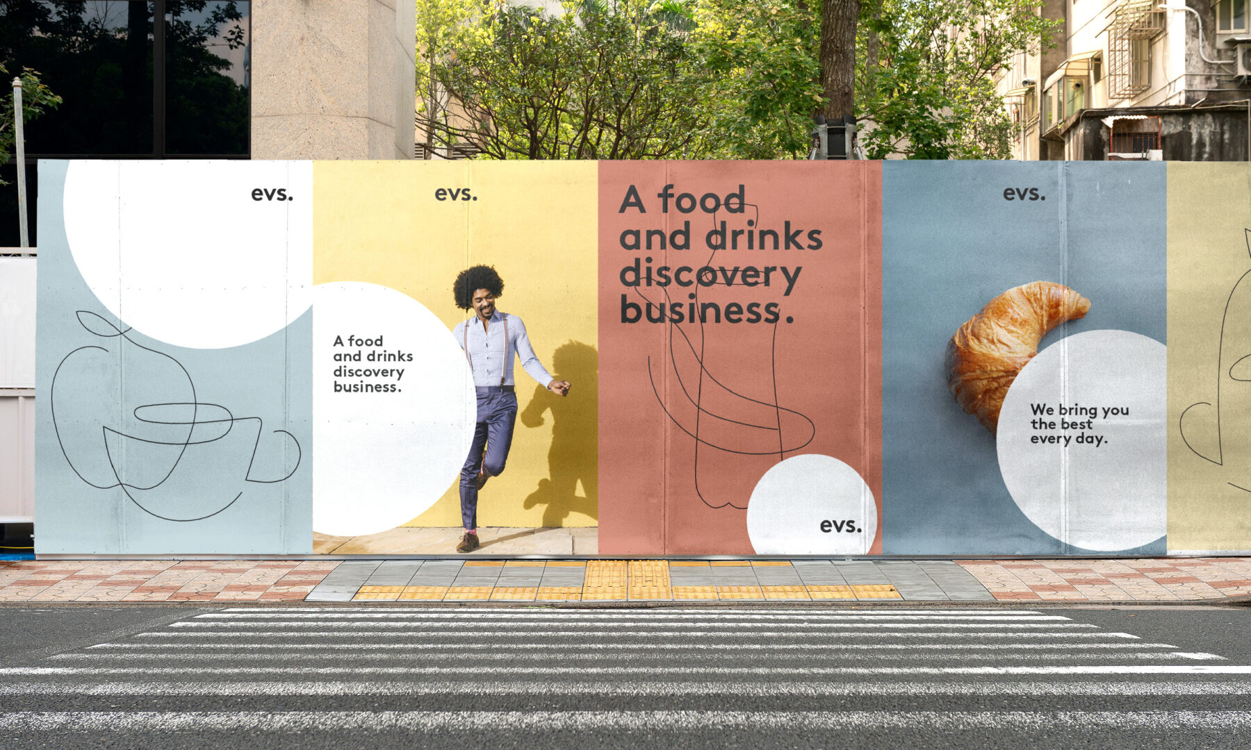
Printed Collaterals
Web Design
Environmental Design
Motion Design
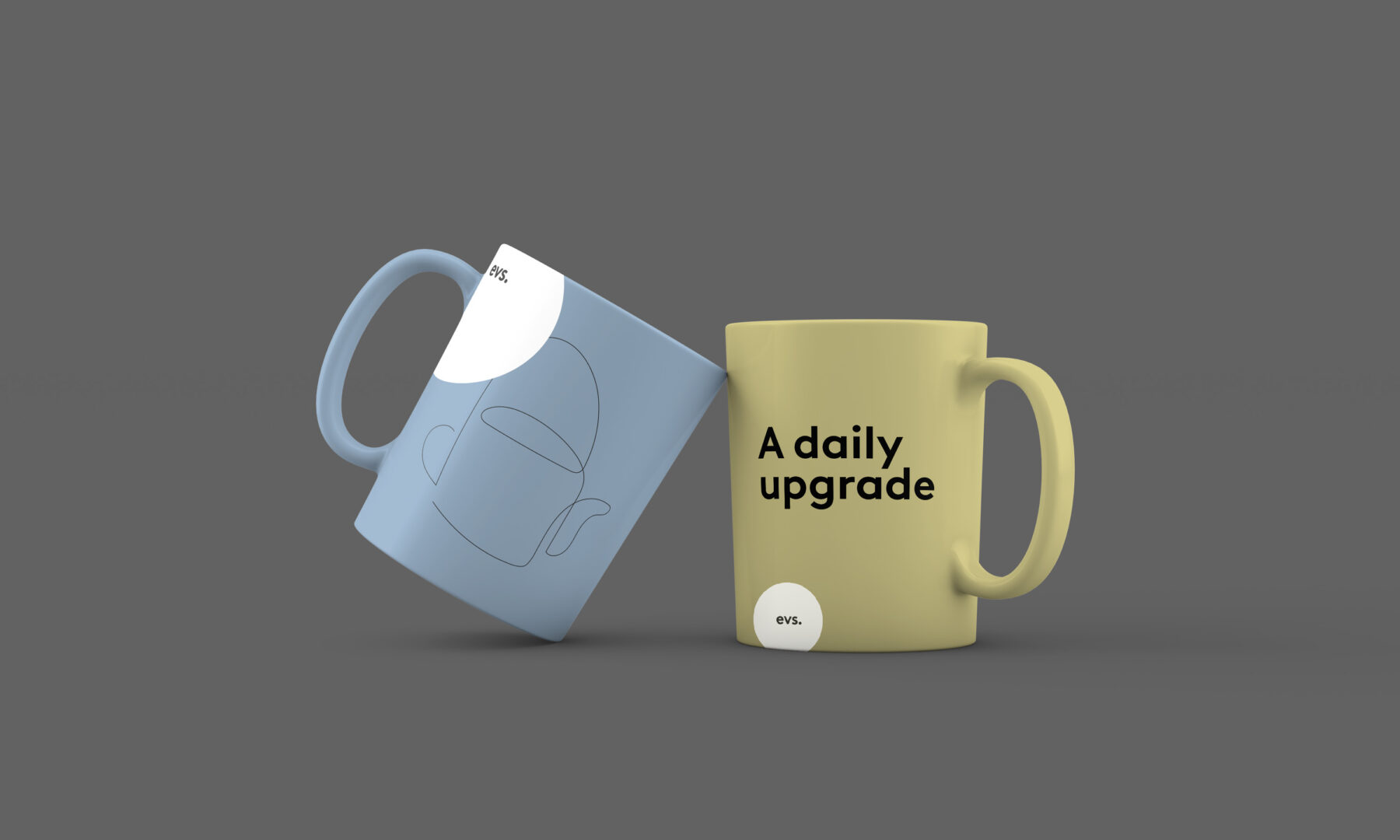
Merchandising
Solution
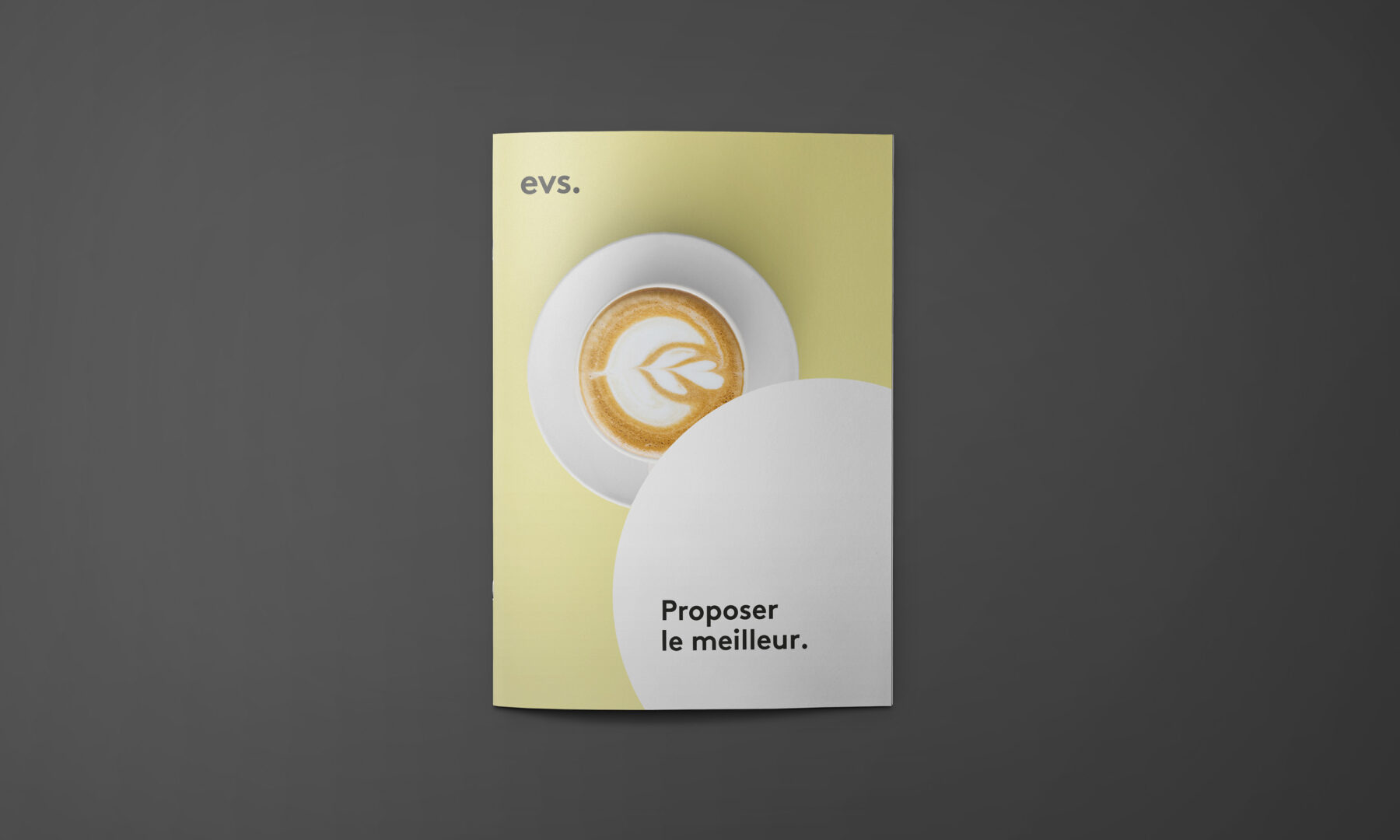
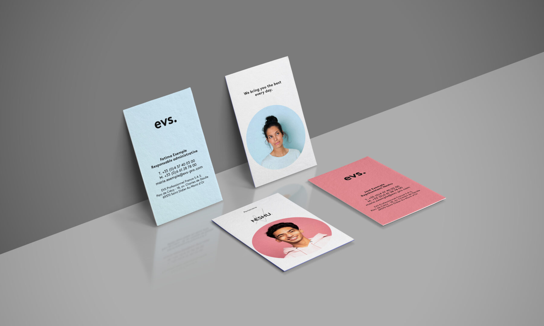
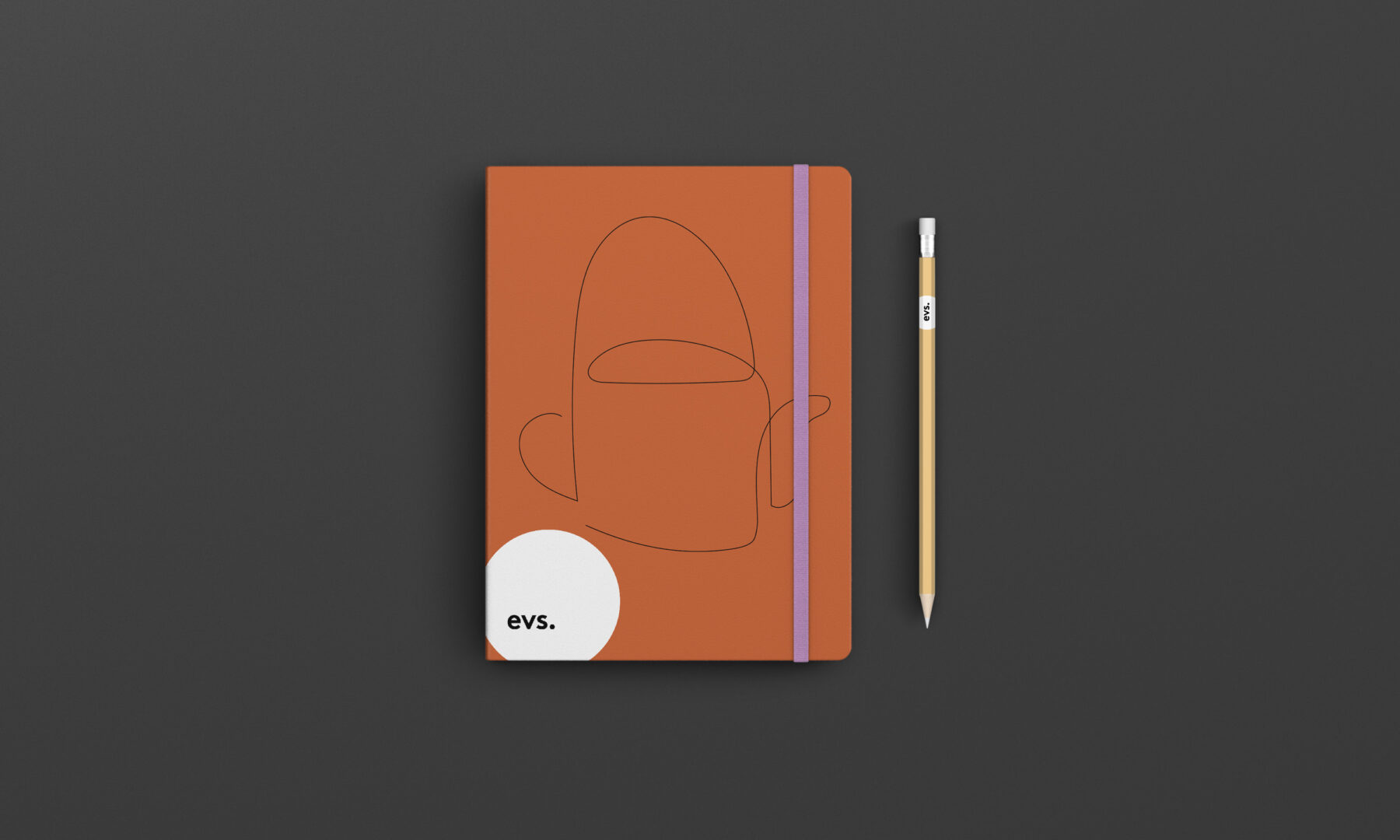
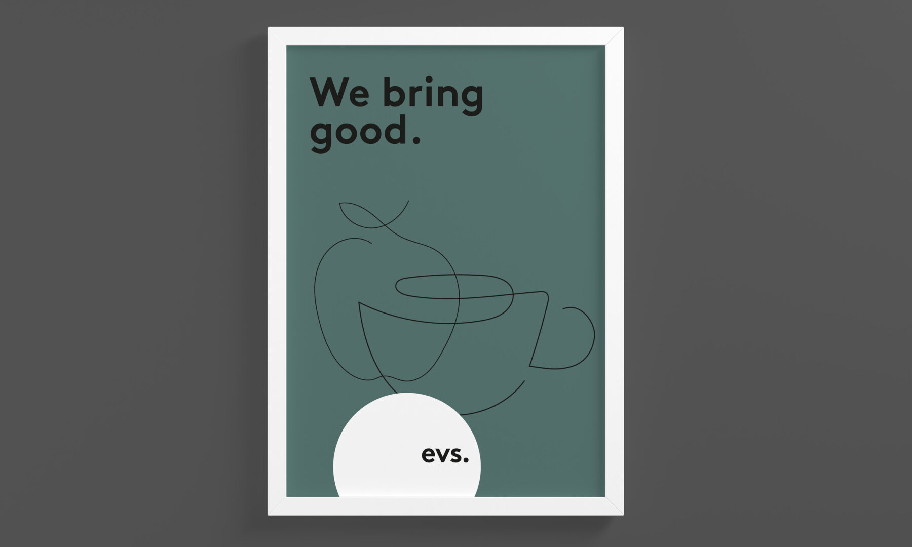
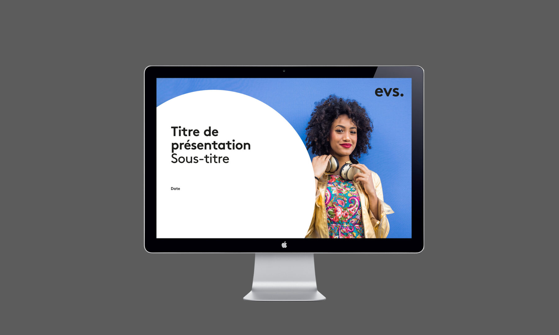
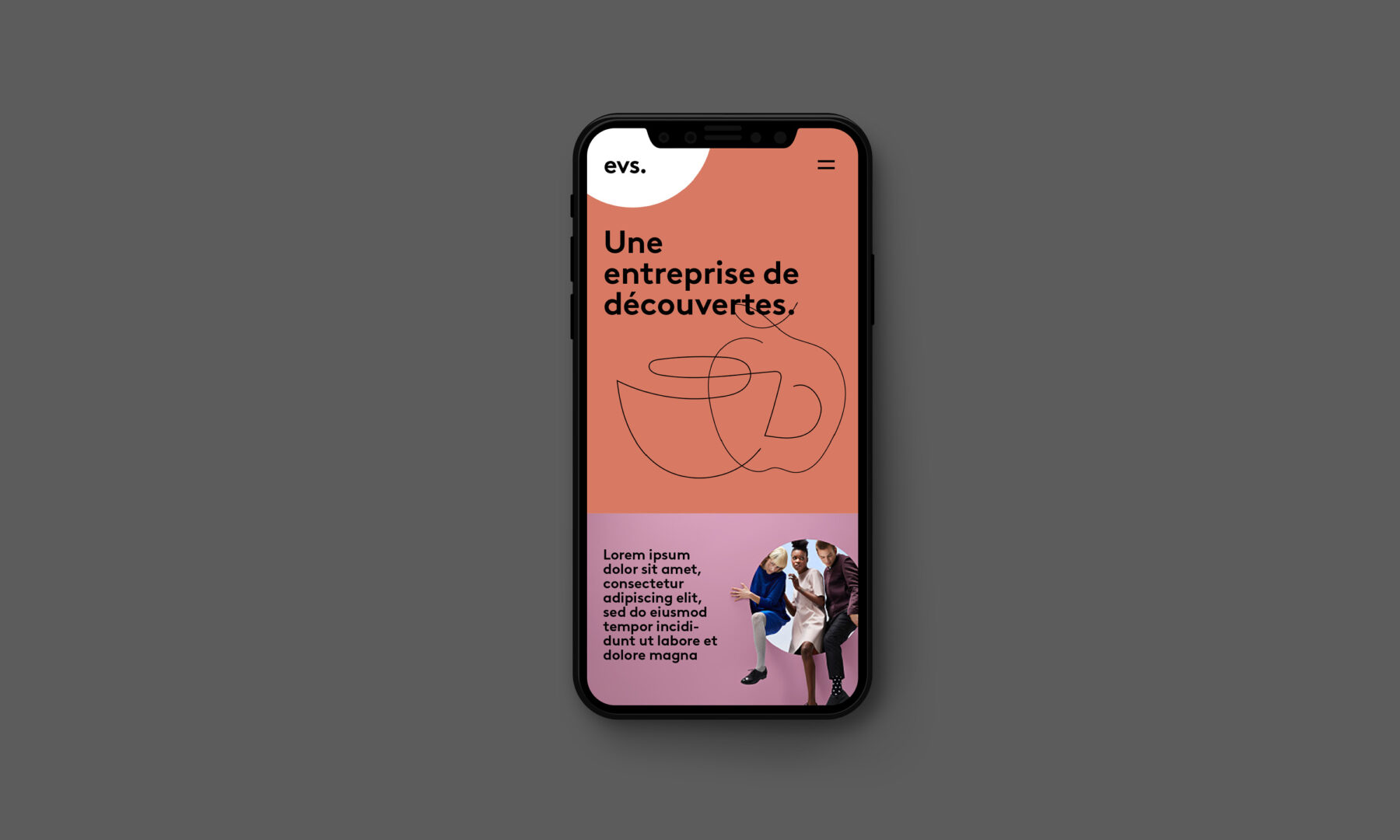
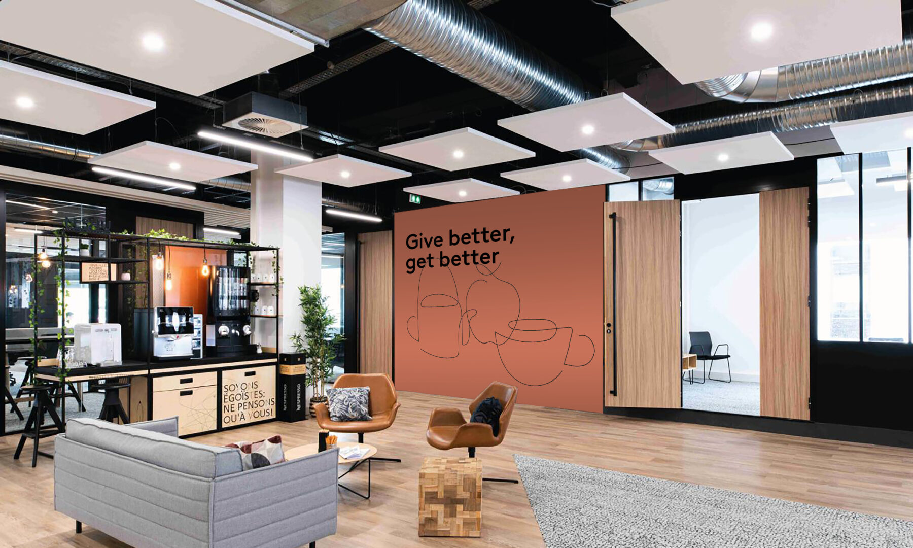
Using universally shared values as our starting point, we created a strong and unifying visual identity and a graphic system that transforms EVS into a human, optimistic, creative, simple and smart brand. The logo embodies this simplicity while remaining both assertive and timeless. The chosen typography, BrownPro, which was designed by Swiss typographer Aurèle Sack, is reminiscent of Helvetica but features a more pronounced and rounded style. That roundness is further enhanced by a period that plays a key role in our new graphic system. That dot represents the center, the globe, perfection in our day-to-day, optimism (like the sun) and a global approach.
We also developed rigorous new iconography and photography guidelines. Colored backgrounds embrace the ideas of simplicity, optimism, and well-being, while highlighting the featured people or objects in a minimalist way. We also created a series of custom drawings, our "Pencil strokes," which are non-pretentious, single line drawings. All of these elements adhere to a creative, simple and human approach, just like the brand itself.
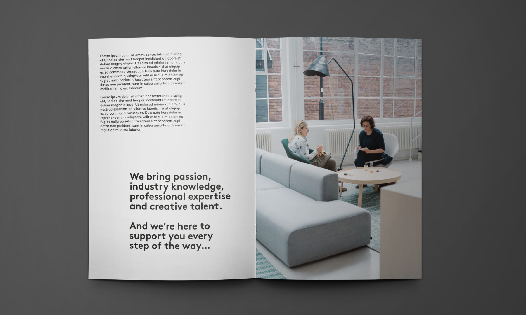
We applied this new graphic system to all of EVS' communication channels and materials, and developed a complete and updated Brand Bible.
Milestones
- Unite under a single strong employer brand
- Upgrading the parent company in the face of strong product brands such as Nespresso
- Create an optimistic, coherent and transversal visual universe
- Unify the brand's discourse on a global level
- Make the brand more visible and more attractive to its audiences
- Strengthen the feeling of belonging for employees in France and Canada
Want to talk about your next challenge?
→ Let's get in touch
++
Hymn Design Sàrl
Rue de Lausanne 64
1020 Renens — Switzerland