Context
Stunning chateaus, rare dwellings, unique hotels, lofts, charming apartments, and luxurious lakeside estates are all on offer through this Geneva-based real estate agency that’s specialized in exceptional properties.
Challenge
The company’s founder, Florence Carteron, felt their brand image needed a refresh to reflect the modern standards held by their esteemed international clientele, a mission we embraced as we worked to transform the visual identity of Affinity Prestige.
Services
Strategy
Forward Thinking
Naming
Brand Identity
Printed Collaterals
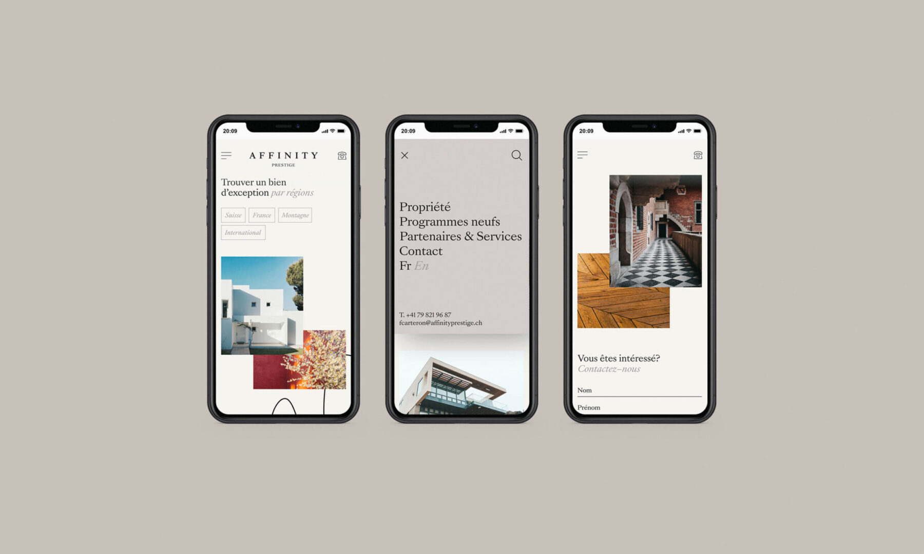
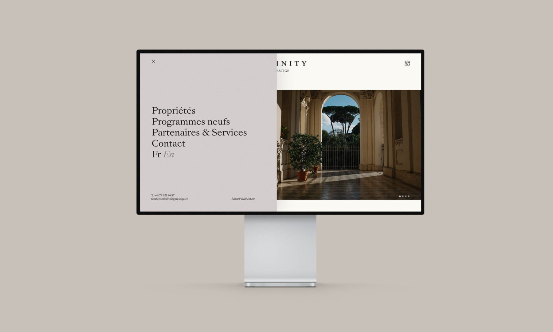
Web Design
Client
Affinity Prestige

Solution
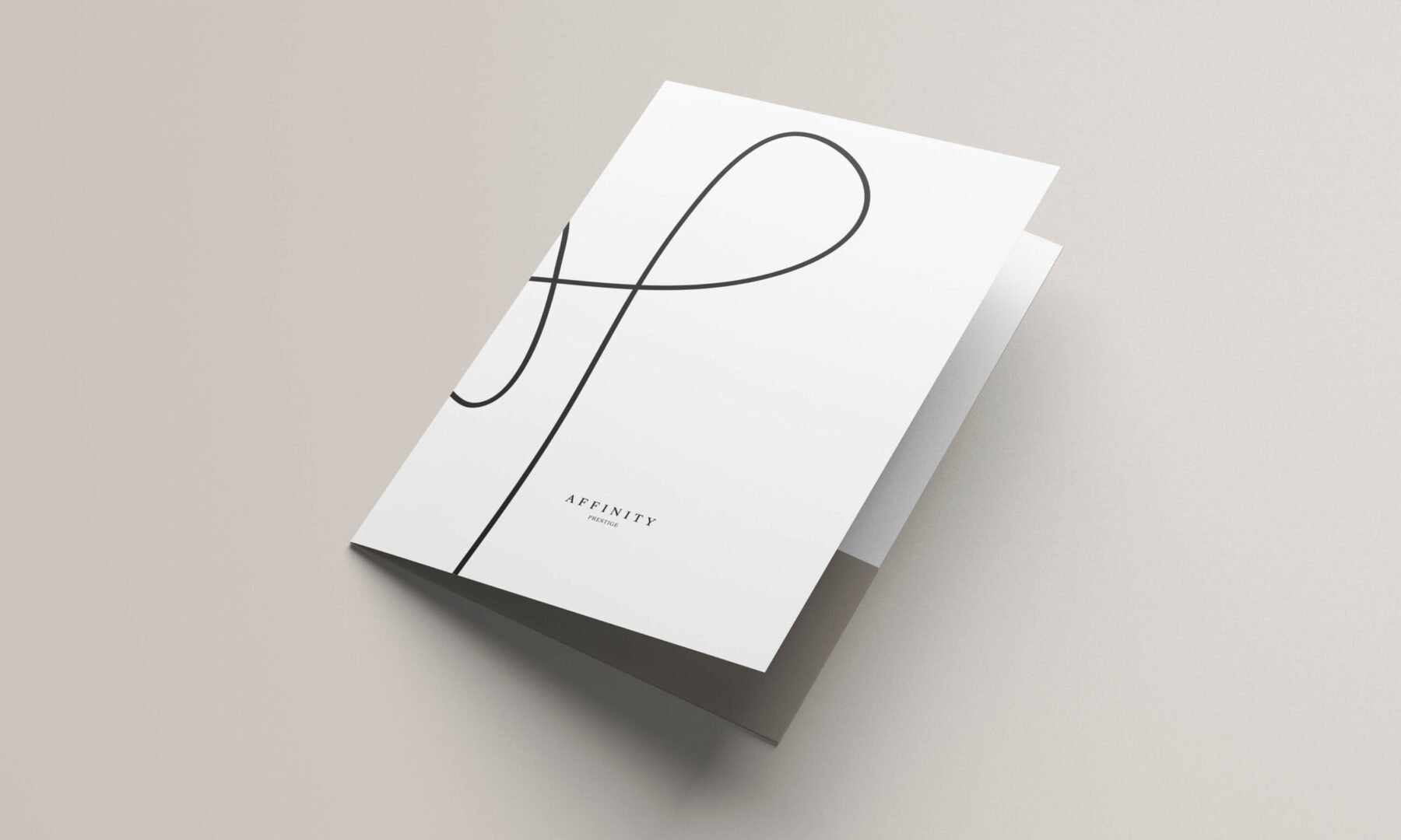
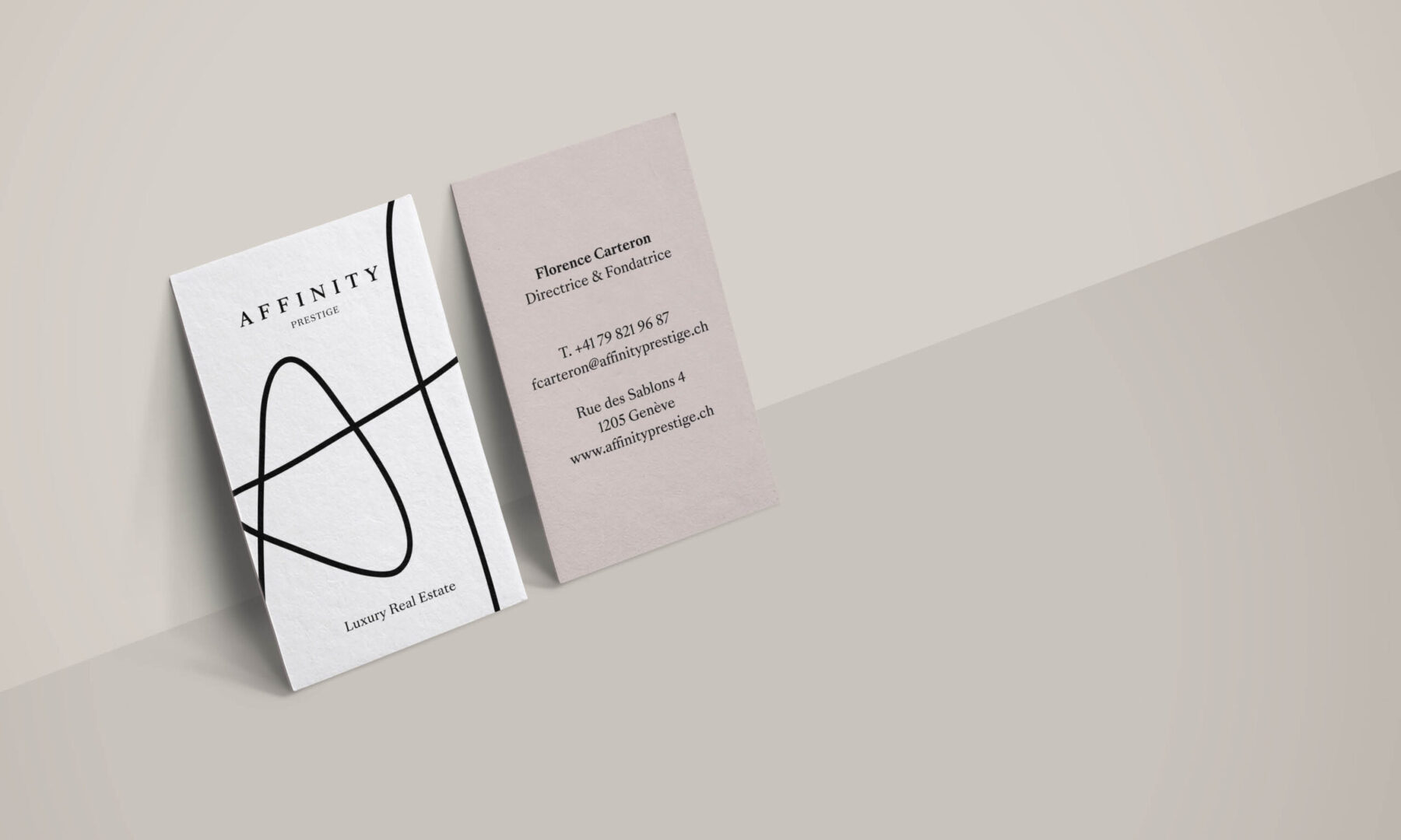
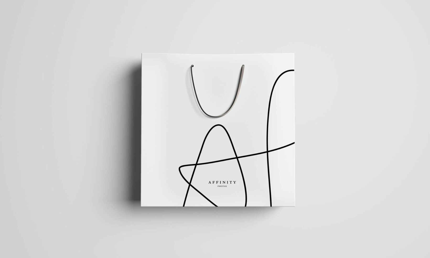
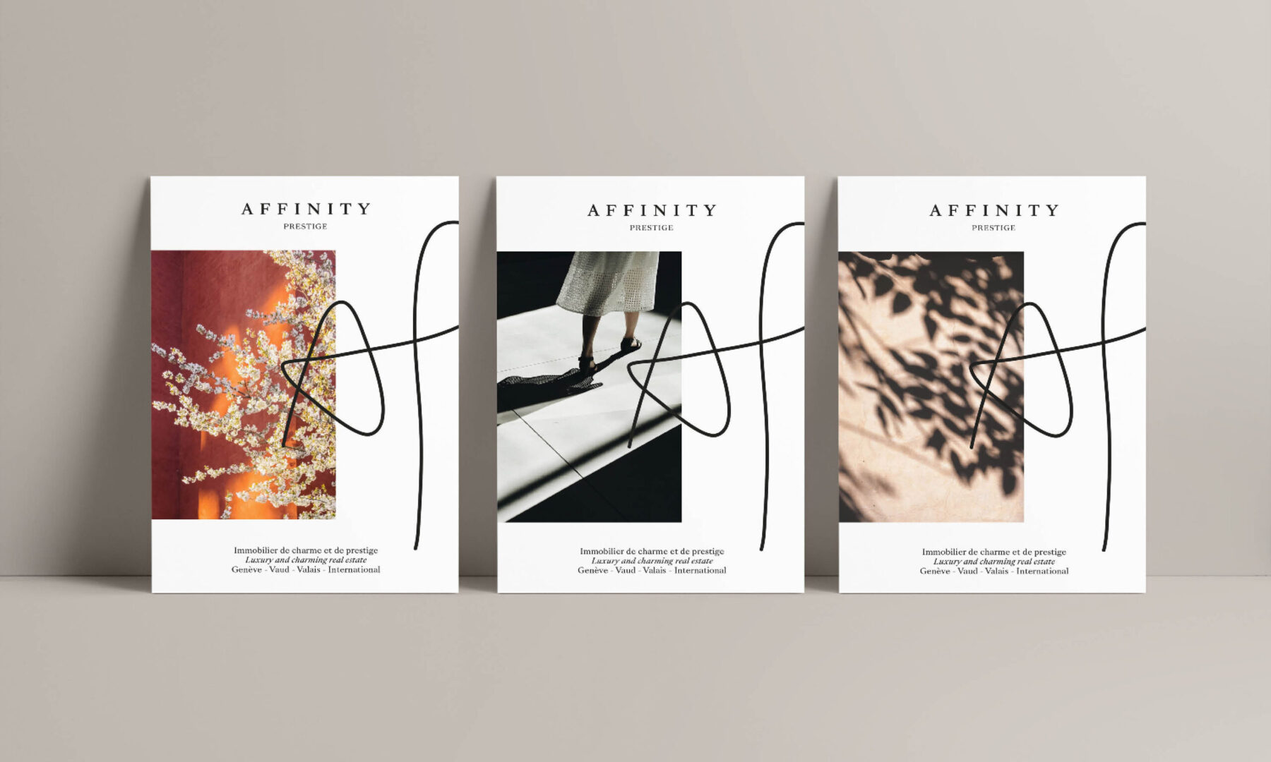
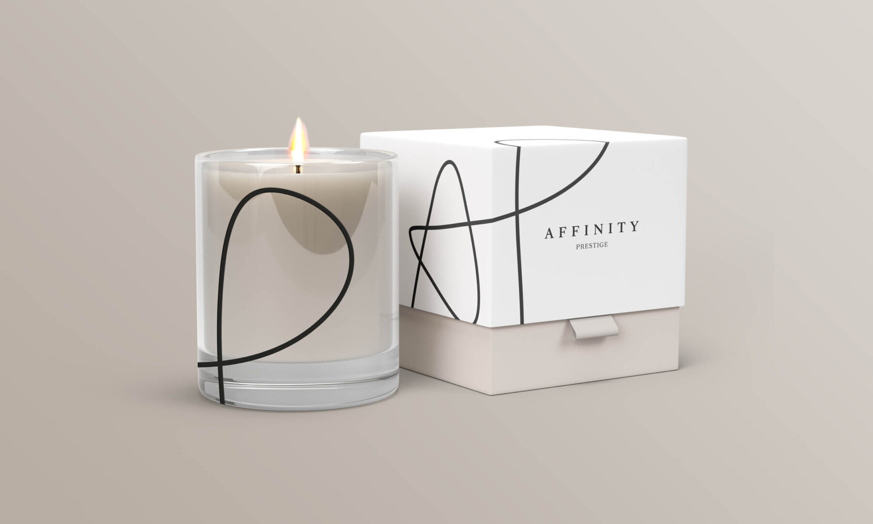
Our branding methodology revealed the core values at the heart of this brand, which are inextricably linked to its founder. Confidentiality, exclusivity, and a notable interest in art helped guide our design. The logo was powered by the “SangBleu Versailles” serif font, which gives its design a timeless touch.
The handwritten shorthand “AP” highlights the company’s focus on personalization and their highly exclusive service offering. The dominant colour for their communications is white, accompanied by warm, light shades of colour that are reminiscent of the cosy-yet-dazzling interiors on offer through the agency.
Want to talk about your next challenge?
→ Let's get in touch
++
Hymn Design Sàrl
Rue de Lausanne 64
1020 Renens — Switzerland