Context & Challenge
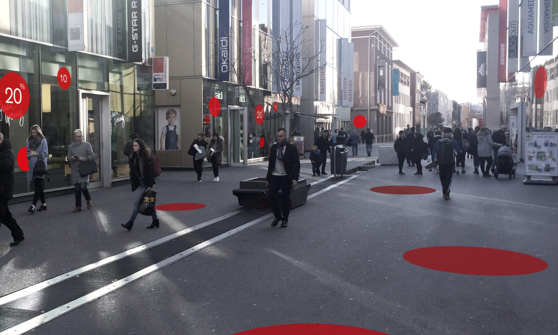
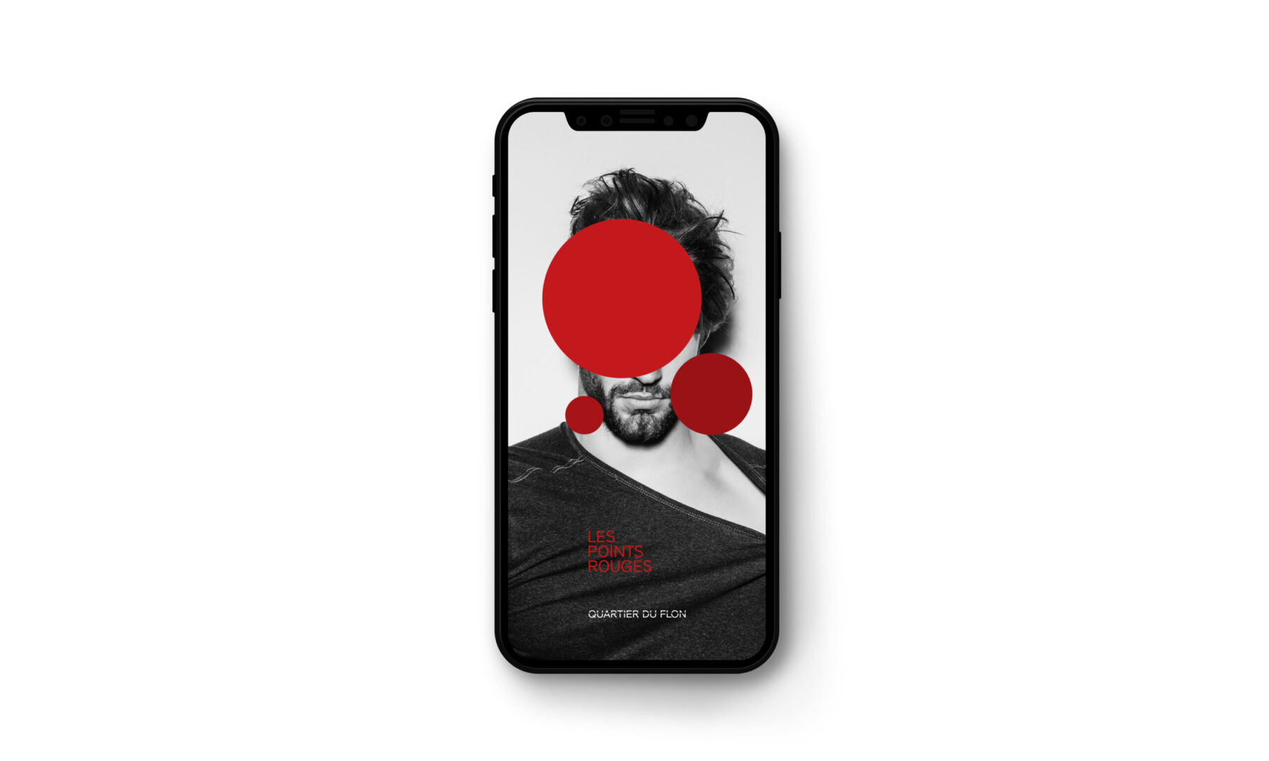
As part of the development of Quartier du Flon (a new brand created in 2014) and the mission to dynamicize its commercial offering, we created “The Red Dots” ("Les Points Rouges") experience. Our goal was to add an experiential component to daily happenings and promotions in the area. When something special is taking place, red dots, reminiscent of Yayoi Kusama, appear in store windows and on the streets, alerting visitors to the activation while also visually guiding them through the neighborhood.
Solution
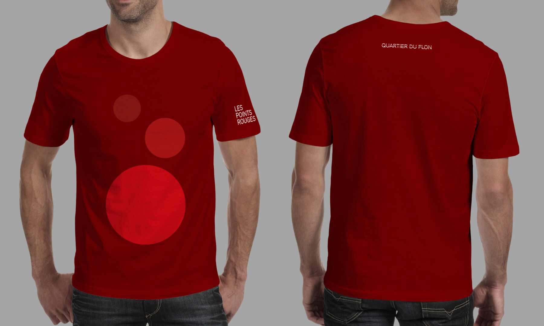
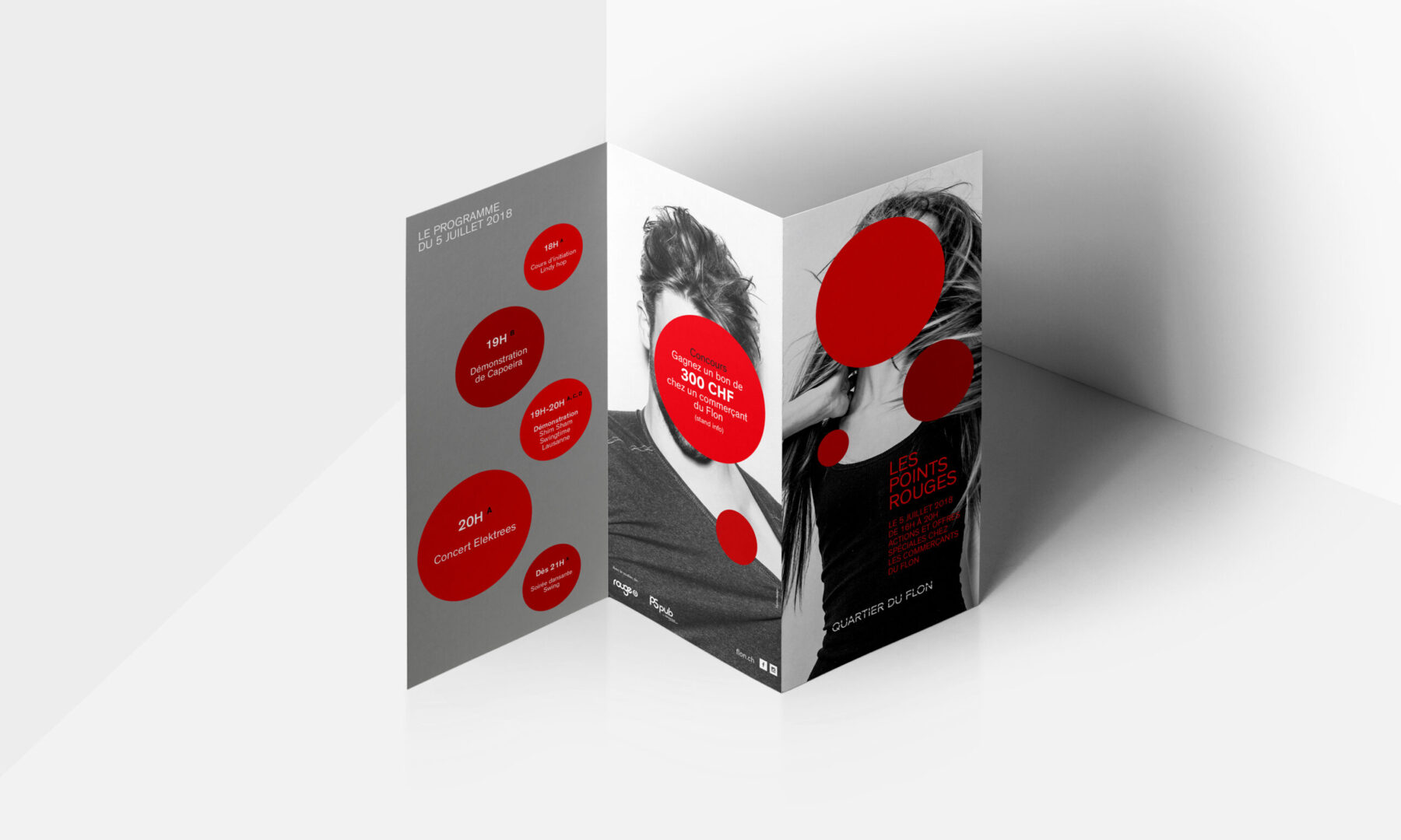
This lively yet simple verbal and visual identity aligns with the branding already in place for Quartier du Flon. The campaign’s trendy visuals include black and white photos of models outrageously collaged with red dots. The Red Dots leave their mark on all the communication materials created for the occasion, including posters, ePanels, brochures, signage and uniforms for event hosts and hostesses.
Services
Strategy
Branding
Digital
Motion design
Signage
Architecture
Type design
Client
Quartier du Flon

Want to talk about your next challenge?
→ Let's get in touch
++
Hymn Design Sàrl
Rue de Lausanne 64
1020 Renens — Switzerland